2017, the start of a new year and for many people resolutions - I usually make one, to have a tidy craft space, which lasts about as long as the next craft session.........then normal chaos is resumed!
The after-Christmas restoration of craft space means the chaos is already well-established, as I can't find anything I need after my daughter reclaimed her bedroom temporarily.On the bright side, I re-discovered lots of stash I had forgotten I had, including several little-used (if at all in some cases!) stamps, which led to an immediate suspension of sorting out in favour of playing.
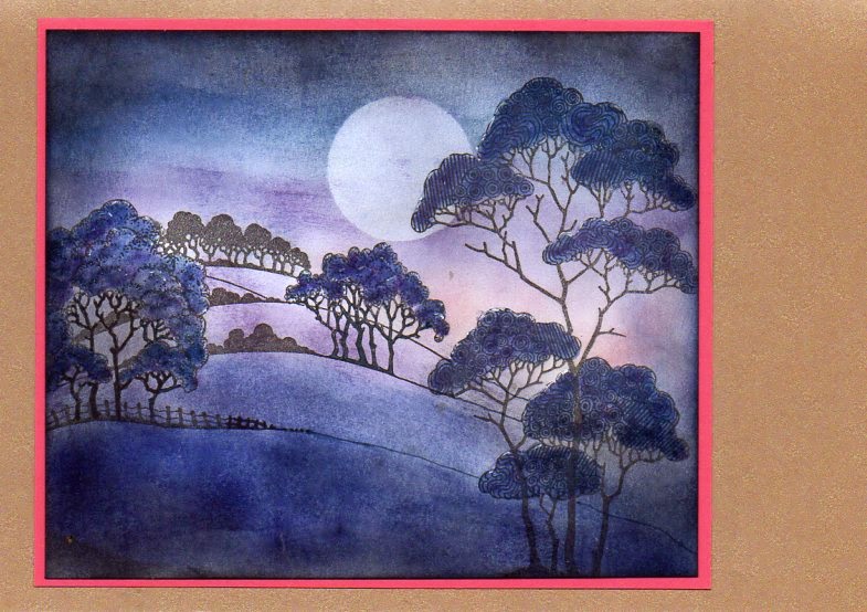
This small landscape card is one result, using a stamp from owl edges with a sentiment from a set of clear stamps , with distress inks.
I have to admit that I normally avoid sentiment stamps, as I am a genius at getting them on crooked, but this set are clear stamps, so I risked stamping onto the card blank.
I though that it was appropriate to use this, as 2017 is the start of a new adventure for Chocolate Baroque, with Lesley's first show on Hochanda at 1100 on Wednesday, although the DT theme for January is romance.......my first official sample is this one, using stamps from harlequin rose. I have used the two largest stamps, with the border stamped using wild honey distress ink as a background and the other as the main image, using black versafine and clear EP.
This was coloured with brusho powders, using Lesley's technique of applying the powder to the dry card and using a waterbrush. The gold swirl was painted with mica powder, also using a waterbrush.
A narrow mat of gold mirri card, then both layers were mounted onto a 7" square white card blank.
I would like to wish you all a very happy, healthy and peaceful new year, with lots of crafting fun thrown in
Showing posts with label distress inks. Show all posts
Monday, 2 January 2017
Wednesday, 27 July 2016
challenge 25
two wintry tangled trees from me this month - loved the chocolate theme, but brain refused to come up with anything!The lovely new tangled birch stamp came to my rescue, along with craft card - one version very plain, the other more atmospheric.
The first one is my favourite of the two, stamped in black versafine onto light craft card and clear embossed.
Wild honey distress ink sponged over the moon, and brown and blue sponged over the sky. Snow was added with a chalk marker pen. Mats are black and gold onto a white 7"square card blank.

Second card is on a cream 8" square card blank. with offset mats in white, copper and black.
Image stamped in versamark and white embossed onto a medium craft card.
Moon again sponged with wild honey, and a diecut oval mask was used when sponging aged mahogany ink round the trees. More snow with the white chalk marker pen, and edges of the card inked with black versafine before matting onto the white card.
I think the new autumn medley stamp would work well with this month's colour scheme, just haven't got around to trying it yet.......
Sunday, 10 July 2016
tangled birch
Two samples using the lovely new tangled birch stamp from Chocolate Baroque.
First card uses a spray starch and mica powder background , which had been lying around for a while but seemed to fit the sunset.
the sky was created with distress inks in various blues and purples, with wild honey and spiced marmalade for the sun.Trees coloured with watercolour pencil.
For this one, the trees were stamped with black versafine ink, and once it was dry I used masking fluid over the image.Distress inks sponged over the sky, again a variety of blues and purples, with wild honey for the moon, and a bit of black soot added to the sky and the ground.
Once it was all dry, rub off the masking fluid and leave the trees white,
I tore the edges to leave a rough white edge, andded a black mat with rounded edges.
The card edges were sponged with broken china ink, and the top branches from the stamp stamped randomly round the edges with broken china.
Wednesday, 27 April 2016
CB challenge 22
For my DT sample for the Chocolate Baroque colour challenge, I used 2 stamps from the butterfly poppy A4 sheet of stamps - another older set which was a firm favourite a while ago, (I really loved the combination of poppies and script) and which fitted the colours.
For the first card, the main image was stamped in black versafine onto white card and clear embossed before colouring with promarkers. The white 15x15cm base card was stamped in opposite coners with the small script stamp using whild honey distress ink before adding the butterfly image on an orange mat.
The second card was stamped with black versafine again, and coloured with pencils, giving a much paler image. The script stamp was stamped all over the 5"x7" white base card in wild honey ink before matting the butterfly onto a paler orange card.
For the first card, the main image was stamped in black versafine onto white card and clear embossed before colouring with promarkers. The white 15x15cm base card was stamped in opposite coners with the small script stamp using whild honey distress ink before adding the butterfly image on an orange mat.
The second card was stamped with black versafine again, and coloured with pencils, giving a much paler image. The script stamp was stamped all over the 5"x7" white base card in wild honey ink before matting the butterfly onto a paler orange card.
Labels:
butterfly poppy,
challenges,
distress inks,
pencils.
Friday, 22 April 2016
rose and poppy
I have made a couple of fairly quick cards using two of my favourite flower stamps from Chocolate Baroque.
The first also uses another favourite, brusho powders.
The image from harlequin rose was stamped with black versafine and clear embossed onto 300gsm white card.
A quick spray with water, then I added yellow, orange and green powders using the dinky plastic spoons that were on the Chocolate Baroque website last year - I hope they will be back at some point, as I would like another set!
Another spritz with water, this time very generously so that the colours spread out around the stamp.
Once it was thoroughly dry, I trimmed the image down, matted it onto black card and then onto a white 5"x7" card blank. It took far longer to dry the image than anything else, Ididn't want to use a heat gun as I liked the spread of colour as it was.
The second card uses a stamp from pretty poppies and a sentiment from mackintosh sentiments.
The poppy was stamped with black versafine and clear embossed, then sponged with distress inks - even quicker!
I love the clear sentiment stamps, it is so much easier to get the sentiment stamped where you want it!
The first also uses another favourite, brusho powders.
The image from harlequin rose was stamped with black versafine and clear embossed onto 300gsm white card.
A quick spray with water, then I added yellow, orange and green powders using the dinky plastic spoons that were on the Chocolate Baroque website last year - I hope they will be back at some point, as I would like another set!
Another spritz with water, this time very generously so that the colours spread out around the stamp.
Once it was thoroughly dry, I trimmed the image down, matted it onto black card and then onto a white 5"x7" card blank. It took far longer to dry the image than anything else, Ididn't want to use a heat gun as I liked the spread of colour as it was.
The second card uses a stamp from pretty poppies and a sentiment from mackintosh sentiments.
The poppy was stamped with black versafine and clear embossed, then sponged with distress inks - even quicker!
I love the clear sentiment stamps, it is so much easier to get the sentiment stamped where you want it!
Labels:
brusho,
distress inks,
harlequin rose,
pretty poppies
Friday, 15 April 2016
mini cards
These are some mini notecards, using 4"x4" white card blanks, just the right size for quick notes.
They are very quick to make as well, I don't think the three of them took longer than 15 minutes at most to make (admittedly, I have friends who swear that I work so quickly that I can do 3 cards in the time it takes them to make 1 - I think they couldn't go more slowly if they tried!)
I cut a mask using a circular die and copy paper, making sure that the hole was towards the centre of the paper. Position this mask over the front of the card blank, and create a mini landscape using distress inks, brushes and the traditional torn copy paper to create the hills. I used peeled paint and broken china inks, as I didn't want too strong an image.
I removed the mask, then stamped the solid thistle stamp from the wild meadow stamp sheet in black memento ink across the card for the first two cards.
The third card I inked the trees from landscape edges in peeled paint and stamped them befored removing the mask - I also stamped the two birds from the same set in broken china.
They are very quick to make as well, I don't think the three of them took longer than 15 minutes at most to make (admittedly, I have friends who swear that I work so quickly that I can do 3 cards in the time it takes them to make 1 - I think they couldn't go more slowly if they tried!)
I cut a mask using a circular die and copy paper, making sure that the hole was towards the centre of the paper. Position this mask over the front of the card blank, and create a mini landscape using distress inks, brushes and the traditional torn copy paper to create the hills. I used peeled paint and broken china inks, as I didn't want too strong an image.
I removed the mask, then stamped the solid thistle stamp from the wild meadow stamp sheet in black memento ink across the card for the first two cards.
The third card I inked the trees from landscape edges in peeled paint and stamped them befored removing the mask - I also stamped the two birds from the same set in broken china.
Friday, 8 April 2016
here be dragons
Whilst blog-hopping, I noticed that the
Male Room challenge was fantasy, which fitted in nicely with my find among my older stamps.
Can't remember how old this set is, but it had a lot of use when I first got it, I loved the crunchy sentiment!
It did need some attention - I had obviously last used it with a glittery 3D medium, and not cleaned it thoroughly, so the dragons got scrubbed with a nail brush and stamp cleaner (yes, I found some of this too!), which eventually removed most of the residue. I also had to replace the cling backing, which was very much the worse for wear ( microwave works well).
The stamps came out none the worse for the rough treatment, a testament to the quality of CB rubber!
I used a 6" square white card blank, stamped the dragons using black versafine ink, then masked them using masking tissue - a bit fiddly to cut out, and if I had thought I could have just stamped the dragons after doing the background..............
Background was distress inks in tumbled glass, broken china and faded jeans brushed on fairly randomly to create a cloudy effect.
Dragons were coloured with marker pens of various makes
Male Room challenge was fantasy, which fitted in nicely with my find among my older stamps.
Can't remember how old this set is, but it had a lot of use when I first got it, I loved the crunchy sentiment!
It did need some attention - I had obviously last used it with a glittery 3D medium, and not cleaned it thoroughly, so the dragons got scrubbed with a nail brush and stamp cleaner (yes, I found some of this too!), which eventually removed most of the residue. I also had to replace the cling backing, which was very much the worse for wear ( microwave works well).
The stamps came out none the worse for the rough treatment, a testament to the quality of CB rubber!
I used a 6" square white card blank, stamped the dragons using black versafine ink, then masked them using masking tissue - a bit fiddly to cut out, and if I had thought I could have just stamped the dragons after doing the background..............
Background was distress inks in tumbled glass, broken china and faded jeans brushed on fairly randomly to create a cloudy effect.
Dragons were coloured with marker pens of various makes
Sunday, 27 March 2016
trifold babushka
I used my old Groovy scoreboard to create a trifold card from a asheet of white A4 card, and marked a point 2" up from the bottom of the left hand corner. I drew a line from this point to the top of the right hand edge of the middle fold.
background came next - distress inks in wild honey, barn door and peeled paint were splodged onto a blending mat, spritzed with water and mopped up with white card.
Once this was dry, I cut it into 3 panels.
I stamped the larger building into the centre of one panel, and the smaller one towards the bottom right of the second pamel, using vintage photo distress ink. i used a waterbrush to add shading to the buildings, and a white pen to add highlights.
The babushka dolls were stamped into the centre of the last panel, stamping the two smaller dolls first. I then masked these with masking tissue before stamping the largest doll behind them.The dolls were coloured with distress inks in wild honey, barn door and vintage photo using a waterbrush.
I trimmed the panel with the dolls to fit the front of the card, glued it down, and then carefully cut along the diagonal line, making sure to cut around the heads of the dolls. The easiest way would be to stamp the dolls at the bottom of the last panel of background , and cut them out and glue them on after trimming the diagonal and glueing the cut-to-size background panel to the front.
I lined up the buildings behind the dolls before marking where to trim the centre panel and glueing it down. the last panel was trimmed so that the buildings were in the bottom corner right hand corner of the panel.
The colours are more accurate in the scan of the folded card, they look a bit washed-out in the photographs.
Once this was dry, I cut it into 3 panels.
I stamped the larger building into the centre of one panel, and the smaller one towards the bottom right of the second pamel, using vintage photo distress ink. i used a waterbrush to add shading to the buildings, and a white pen to add highlights.
The babushka dolls were stamped into the centre of the last panel, stamping the two smaller dolls first. I then masked these with masking tissue before stamping the largest doll behind them.The dolls were coloured with distress inks in wild honey, barn door and vintage photo using a waterbrush.
The colours are more accurate in the scan of the folded card, they look a bit washed-out in the photographs.
Monday, 7 March 2016
babushka dolls
it was great fun playing with the new Babushka doll stamps from Chocolate Baroque, although I did wish that they had been larger stamps!
I found a pack of readymade card blanks from years ago that were just the right size, ending up at 15.3 cm square when folded down.
I dabbed distress inks in tumbled glass and peeled paint onto a craft mat, spritzed wuith water and mopped the colour up with a sheet of white card.
All the images were coloured with watercolour pencils, then the dolls were cut out and mounted onto the diamond shaped piece for the centre of the card.
I added orange mats to pick up the colours of the dolls.
The colours in the scanned image are more accurate than those in the photos, an overcast day was the brightest I could manage when I took the photos -needless to say, the sun has now come out!
Wednesday, 21 October 2015
October postcards

October postcards for the Chocolate Baroque potpourri challenge - had to use the colour this month which was heather, and this is what I eventually came up with. Have to admit that I spent a lot of time searching for two particular stamps that I still haven't found in the disaster area that is officially my daughter's bedroom - even more disaster than normal as a good part of the contents went to a WI craft day, and still haven't made it back to their allotted homes....
Fast running out of time, I decided to make landscapes using the terrific treescapes set of clear stamps (these seem to be no longer available, which is a great pity as there are some very useful trees there), the now traditional torn paper and brushes and sponges. Inks used were victorian velvet, milled lavender and dusty concorde distress inks and Stampin Up concorde crush.
These would also seem to fit the challenge 167 at addicted to stamps and more, which is make your mark.
thanks Judith and Lesley for letting me know that the stamps will be back on the website soon - just out of stock at the moment! Look out for terrific treescapes, CBCL 0009
Sunday, 4 October 2015
challenge 15 again
another quick Chocolate Baroque challenge entry, this time using a stamp from terrific treescapes, and another sponged background.
Base card is 6x6 , and it is clean, spots are from scanner!
No greeting as I haven't decided what it will be for yet......
Base card is 6x6 , and it is clean, spots are from scanner!
No greeting as I haven't decided what it will be for yet......
challenge 15
very quick post with an entry for the Chocolate Baroque colour challenge
Very simple, image stamped in black versafine, then the star sponged in yellow, sky in grey - base white card is A5
Sunday, 19 July 2015
poppy easel
This is the poppy easel card I made at Gissing last Sunday starting from an idea by Moira Walters, using Hobby Art poppy stamps.
I used both stamps in the set instead of just the smaller one - just had to be different!
The base card is a 6x6 square white card.
I stamped the larger poppy stamp across the centre of a piece of 6x6 white card, using black versafine. The poppies were coloured with distress inks in spiced marmalade and brick red, with peeled paint for the leaves, using a waterbrush. I added a fairly random wash of green and orange across the card to try to give the impression of more poppies in the background. I stamped the smaller image several times, coloured the flowers to match, then cut out the flowers and arranged them across the front of the stamped image. Fussy cut round the top of the image.
Stamped the smaller image again, and coloured to match the first image, then fussy cut round the top and sides, leaving a flap at the bottom so that it would stand up.
The tricky bit is placing this so that it forms the stop for the easel bit, but low enough down the base that the card will still fold flat. Moira had worked out how to hide the flap, which worked brilliantly - a piece of green card in my case, cut slightly smaller to fit inside the card. Place the stop piece in position, check the card will still fold, then mark where you want it on the base piece - cut a slit in said base piece, insert the stop and glue it down; then glue the base to the card. Much easier and tidier then cutting strips of card!
I used both stamps in the set instead of just the smaller one - just had to be different!
The base card is a 6x6 square white card.
Stamped the smaller image again, and coloured to match the first image, then fussy cut round the top and sides, leaving a flap at the bottom so that it would stand up.
The tricky bit is placing this so that it forms the stop for the easel bit, but low enough down the base that the card will still fold flat. Moira had worked out how to hide the flap, which worked brilliantly - a piece of green card in my case, cut slightly smaller to fit inside the card. Place the stop piece in position, check the card will still fold, then mark where you want it on the base piece - cut a slit in said base piece, insert the stop and glue it down; then glue the base to the card. Much easier and tidier then cutting strips of card!
Monday, 18 May 2015
Chocolate Baroque challenge
A very quick post for the Chocolate Baroque challenge 10 to squeak in just under the time limit!
As is so often the case, the longer time I have to do something, the longer it takes me to actually do it - if it is needed tomorrow, fine , next week is more problematical, daft isn't it?
Anyhow it took me a while to find something approaching the required colours especially since my long-neglected glimmer mists mostly refused to co-operate, so it was back to distress inks. The search for the glimmer mists (put away neatly in a drawer, most unusually!) also turned up a long neglected set of stamps, patchwork landscape.
One of this set got a lot of use, so it was way past time for some of the others to see ink for the first time.
I eventually stamped both images in black versafine, then used a variety of ink pads and sponges to create the landscape, mostly dusty concord, chipped sapphire and black soot. the trees were coloured with dusty concord dabbed on with a cotton bud, then painted over with chipped sapphire using a water brush. A few dabs of white pen and a wash of clear wink of stella to try to catch the moonlight on the foliage, trunks coloured with marker pen.
A narrow mat of bright pinky purple card to give a bit of fizz, then mounted onto a base of pearlesent cappucino card
As is so often the case, the longer time I have to do something, the longer it takes me to actually do it - if it is needed tomorrow, fine , next week is more problematical, daft isn't it?
Anyhow it took me a while to find something approaching the required colours especially since my long-neglected glimmer mists mostly refused to co-operate, so it was back to distress inks. The search for the glimmer mists (put away neatly in a drawer, most unusually!) also turned up a long neglected set of stamps, patchwork landscape.
One of this set got a lot of use, so it was way past time for some of the others to see ink for the first time.
I eventually stamped both images in black versafine, then used a variety of ink pads and sponges to create the landscape, mostly dusty concord, chipped sapphire and black soot. the trees were coloured with dusty concord dabbed on with a cotton bud, then painted over with chipped sapphire using a water brush. A few dabs of white pen and a wash of clear wink of stella to try to catch the moonlight on the foliage, trunks coloured with marker pen.
A narrow mat of bright pinky purple card to give a bit of fizz, then mounted onto a base of pearlesent cappucino card
Sunday, 12 April 2015
swing card
This is the swing card I made this afternoon at Gissing with Moira Walters - had to scan it as not enough light to even try to take a decent photo.
All the stamps used are from the forest friends set by Hobby Art, owls coloured with Stampin Up markers and the rest with distress inks and a sponge. The dies used were spellbinders. The owl in front was stamped on a separate piece of card and cut out before gluing onto the card.
This is the inside of the card laid out flat
have added photos of open card
All the stamps used are from the forest friends set by Hobby Art, owls coloured with Stampin Up markers and the rest with distress inks and a sponge. The dies used were spellbinders. The owl in front was stamped on a separate piece of card and cut out before gluing onto the card.
This is the inside of the card laid out flat
have added photos of open card
Friday, 20 February 2015
February postcards

The challenge for this month over at Chocolate Baroque was either violets or the colour lilac - not having any violet stamps, that meant the colour again. I'm none too sure that these even vaguely class as lilac, but the ink pads were the nearest I had, and I'm sure I have seen lilac growing in different shades of purple - that's my excuse, anyway!
I was a bit stuck for ideas too, then came across one of the Paris sets of stamps, and thought that might go - city of romance etc and valentines day in February............
The top one was one of the first efforts, using a piece of brusho'd card , very roughly overstamped with a stamp from gothic fragments. I used a stencil of Paris found at the recent Thetford papercraft show with dusty concord ink over that, then added the image of Notre Dame stamped in black versafine on white card, coloured with victorian velvet ink and cut out. I darkened the stencilled birds with black soot as I didn't think they stood out enough.
I felt that this was a bit on the dark side, so tried to get a lighter effect with later efforts.
The second one was sponged with victorian velvet ink first, then the same stamp from gothic fragments in milled lavender. . The stamp and stencil were again in dusty concord, which was also sponged around the images.
Sunday, 8 February 2015
Friends
Friends is appropriate, as it is not only applies to the sentiment but to Moira and Janet who provided the inspiration and the stamps!
The first card is loosely based on two cards Moira did for her workshop yesterday - Janet has blogged her versions here, so you can see the differences!
I used 3 different sizes of the Spellbinders peony dies to cut the aperture masks just to see if |I could make more of an arrangement of flowers rather than single ones. Did work, but got very fiddly using both the apertures and the diecut shapes as masks.
Background done with distress inks in peacock feathers and picked raspberry - Moira's version of the bleeding tissue technique for this involved lots of water and kitchen roll, and definitely needed bright ink colours to start with, subtle just doesn't work.
Distress inks brushed and sponged through the masks, mostly using spiced marmalade and fired brick, leaf shape mask cut by hand and sponged with peeled paint ink. The stamps are by Hobby Art, using archival black for the flower centres and peeled paint for the swirls. Card cut down to 5.5" square and matted onto nearest pink card I could find to the background colour, then onto a 6x6" square white card blank.
Janet had been playing with the bokeh technique, using pan pastels and a Clarity moon mask set. My version used distress inks in wild honey, spiced marmalade and fired brick, with the white circles in brilliance moonlight white. Greeting is a Claritystamp, stamped on vellum using archival black - vellum secured on the back of the inked strip using redline tape, and the brad holding the paper flowers together goes through both the vellum and the card as well. Flowers were white, inked with spiced marmalade distress ink and impress chocolate. Matt is orange card, card blank is 5"x7".
The first card is loosely based on two cards Moira did for her workshop yesterday - Janet has blogged her versions here, so you can see the differences!
I used 3 different sizes of the Spellbinders peony dies to cut the aperture masks just to see if |I could make more of an arrangement of flowers rather than single ones. Did work, but got very fiddly using both the apertures and the diecut shapes as masks.
Background done with distress inks in peacock feathers and picked raspberry - Moira's version of the bleeding tissue technique for this involved lots of water and kitchen roll, and definitely needed bright ink colours to start with, subtle just doesn't work.
Distress inks brushed and sponged through the masks, mostly using spiced marmalade and fired brick, leaf shape mask cut by hand and sponged with peeled paint ink. The stamps are by Hobby Art, using archival black for the flower centres and peeled paint for the swirls. Card cut down to 5.5" square and matted onto nearest pink card I could find to the background colour, then onto a 6x6" square white card blank.
Janet had been playing with the bokeh technique, using pan pastels and a Clarity moon mask set. My version used distress inks in wild honey, spiced marmalade and fired brick, with the white circles in brilliance moonlight white. Greeting is a Claritystamp, stamped on vellum using archival black - vellum secured on the back of the inked strip using redline tape, and the brad holding the paper flowers together goes through both the vellum and the card as well. Flowers were white, inked with spiced marmalade distress ink and impress chocolate. Matt is orange card, card blank is 5"x7".
Friday, 28 November 2014
p p p pick up a penguin
After the WI meeting, I had several stamped Hobby Art penguins over - quite a few of the older members were unable to come to the meeting - so rather than waste them I decided to make a slider card. I haven't made one of these for quite some time, and this was the first effort - he slides nicely, but doesn't do somersaults, so need to work out why next.
Background was done with distress inks, sponges and the traditional torn paper, and the penguin is attached to 2 pennies with foam pads, one either side of the slit in the card. Did have to make a quick trip to Jane's to get some small round foam pads - they came out of the clearance basket, too!
The card is mounted onto the base with more sticky pads, so the pennies have room to move.
The second card took almost as long in the actual making - the Chocolate Baroque penguins were actually stamped at the same time as the other penguins, but only got coloured in on Wednesday. Background again distress inks, and the mat is some very ancient holographic silver card.
There are a couple of individual penguins and snowmen in this set as well as the stamp I used.
for those quick off the mark, check out the websites, as both Hobby Art and Chocolate Baroque have sale offers at the moment.
Background was done with distress inks, sponges and the traditional torn paper, and the penguin is attached to 2 pennies with foam pads, one either side of the slit in the card. Did have to make a quick trip to Jane's to get some small round foam pads - they came out of the clearance basket, too!
The card is mounted onto the base with more sticky pads, so the pennies have room to move.
The second card took almost as long in the actual making - the Chocolate Baroque penguins were actually stamped at the same time as the other penguins, but only got coloured in on Wednesday. Background again distress inks, and the mat is some very ancient holographic silver card.
There are a couple of individual penguins and snowmen in this set as well as the stamp I used.
for those quick off the mark, check out the websites, as both Hobby Art and Chocolate Baroque have sale offers at the moment.
Labels:
chocolate baroque,
distress inks,
hobby art,
slider card
Monday, 27 October 2014
Clarity on Saturday
These are the cards I made on Saturday at the Clarity East workshop with Janet - of course, after 3 days of lousy weather, Saturday was lovely and sunny, and even quite warm.............
Still, we had a good time getting inky!
For the first card we used distress inks and glimmer spray mixed on a craft mat and dabbed on with a sponge to create the background - I actually used blue inks, but they turned green as the glimmer spray was a gold one.
The reindeer was stamped on a separate piece of card and glued behind the aperture, mounted onto a green mat and then onto a card blank which had the treestamp stamped randomly round the edges. Fir trees in front were stamped and cut out, and a bit of glitter added.
The second card used the same stamps - the sky was dabbed with white acrylic paint using the sponge again before brushing with stormy sky distress ink. reindeer and trees were stamped with chipped sapphire, mats are blue card.
This one was my favourite, and I have several spare bits to make more cards.
The final card was based on a design by Lynne Hammond, and used the sweater set of stamps - it was actually easier to do than it looked, but it did take all the afternoon...............and no-one needed the valium!
We cut masks to help with stamping the designs onto the sweater, which were stamped in versamark and white embossed, and used masking tape to help line up the stamps for the background (would have been a lot easier with a stamp positioner..............)
Still, we had a good time getting inky!
For the first card we used distress inks and glimmer spray mixed on a craft mat and dabbed on with a sponge to create the background - I actually used blue inks, but they turned green as the glimmer spray was a gold one.
The reindeer was stamped on a separate piece of card and glued behind the aperture, mounted onto a green mat and then onto a card blank which had the treestamp stamped randomly round the edges. Fir trees in front were stamped and cut out, and a bit of glitter added.
The second card used the same stamps - the sky was dabbed with white acrylic paint using the sponge again before brushing with stormy sky distress ink. reindeer and trees were stamped with chipped sapphire, mats are blue card.
This one was my favourite, and I have several spare bits to make more cards.
The final card was based on a design by Lynne Hammond, and used the sweater set of stamps - it was actually easier to do than it looked, but it did take all the afternoon...............and no-one needed the valium!
We cut masks to help with stamping the designs onto the sweater, which were stamped in versamark and white embossed, and used masking tape to help line up the stamps for the background (would have been a lot easier with a stamp positioner..............)
Monday, 13 October 2014
woodland glade
Had a lovely peaceful afternoon yesterday at Gissing with Moira, who showed us her makes from the Hobby Art workshop the day before, and let us loose on her collection of stamps - and yes, she did make sure she got them all back!
One of her cards with the robin on wellies had a new fold, which I have to admit drove me mad as I couldn't get it to stand up, so I added another card blank behind and left off the tag at the top of the original.
I chose to use the new woodland glade set, which I love - am sure it could be made to work with any season.........but my version is winter.
The background was using distress inks in broken china and peeled paint and crumpled cling film, dabbing the ink randomly over the card.
The images for the front panel were stamped with black versafine, and coloured using marker pens scribbled onto an acrylic block and a water brush.
The greeting came from a different set, and the small pine trees were hastily added to cover up a smudge of ink from the edge of the rockablock the stamp was mounted on - benefit of clear stamps is that I could make sure the darkest tree was over the line!

The second card used the same stamps and the rest of the background piece of card, but I used distress inks and a water brush to colour in this time.
Both cards are on 6"x6" blanks, and the smudge on the second one is from the scanner - it is definitely not on the card! But I do admit to needing a new blade in my trimmer...................think I may have had better photos on my phone from yesterday, as the light was so much better but not worked out how to get them on the computer yet!
One of her cards with the robin on wellies had a new fold, which I have to admit drove me mad as I couldn't get it to stand up, so I added another card blank behind and left off the tag at the top of the original.
I chose to use the new woodland glade set, which I love - am sure it could be made to work with any season.........but my version is winter.
The background was using distress inks in broken china and peeled paint and crumpled cling film, dabbing the ink randomly over the card.
The greeting came from a different set, and the small pine trees were hastily added to cover up a smudge of ink from the edge of the rockablock the stamp was mounted on - benefit of clear stamps is that I could make sure the darkest tree was over the line!

The second card used the same stamps and the rest of the background piece of card, but I used distress inks and a water brush to colour in this time.
Both cards are on 6"x6" blanks, and the smudge on the second one is from the scanner - it is definitely not on the card! But I do admit to needing a new blade in my trimmer...................think I may have had better photos on my phone from yesterday, as the light was so much better but not worked out how to get them on the computer yet!
Subscribe to:
Posts (Atom)