This is a catch-up post, as I have been very much AWOL during the last month.
OH was rushed into hospital at the beginning of December and has been in and out ever since - he's currently out, awaiting call for an op sometime in the immediate future. Practically anything technological that could go wrong did at the same time, including the phone line and broadband - all hopefully now fixed, together with a new mobile to replace the one that leapt out of my pocket...........
The first scan is of the covers for the
Chocolate Baroque technique tags book. I have to admit that I didn't do new tags for this, just resurrected earlier tags that I didn't use at the time they were made - the top will be the cover, and the words from
artistic affirmations were resist stamped using versamark and white embossing powder before inking the sky and stamping the foliage.
The back cover used a Tim Holtz embossing folder, tag background sponged with distress inks before inking the embossed image with versamark and gold embossing powder once the background was completely dry - the result if it isn't dry can be quite interesting, but is usually just a mess!

The cards were made yesterday at a workshop in Gissing with Moira, the first time I had picked up an inkpad with crafty intentions for weeks - it was a lovely day, and a really nice change.
The stamps used are all by
Hobby Art, most of them Moira's - if she hasn't got the complete set, I shall be very surprised!- and the cards are all cream and 14.5cm square.
The butterflies were stamped on acetate with stazon, which was then coloured with alcohol inks on the reverse side and left to dry before cutting out. I used the solid flowers set to stamp the background,using victorian velvet and milled lavender distress inks , then stamped the butterflies fairly randomly across the card. The acetate butterflies were cut out and glued over the stamped images. Matts are matt gold and the nearest pink I could find to match the stamping.

The background for the last card used repeat stamping of a script stamp and a sort-of sacking effect stamp using old paper and antique linen distress inks. The words were stamped in black memento ink, then the small spray from falling leaves stamped round four times to make a wreath using bundled sage. I regretted using this stamp as I then had to colour in the leaves with promarker as they didn't stand out enough from the background.
The maple leaves were stamped with memento london fog - guess who picked up the wrong dewdrop pad without looking first - coloured with promarkers using big slashes of colour with the broad tip and then some blending pen before cutting out and mounting with foam pads. The matts are dull gold and an orange that matched the promarker colour.

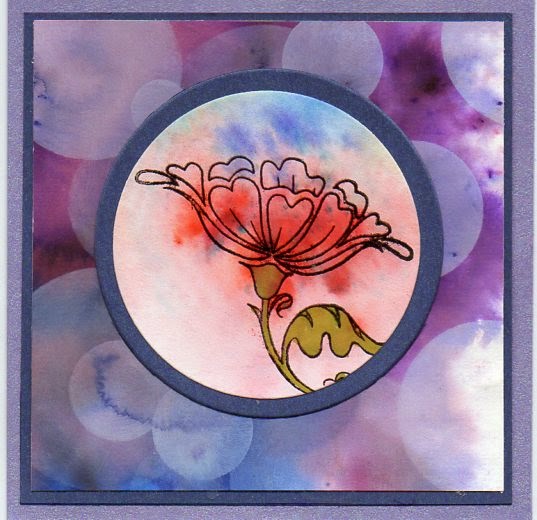 The stamp is from Hobby Art, bought before Christmas and not used until now, stamped onto more bits of brushoed card - I did colour the leaves and stems in with promarker, left the flowers as they were. Cut out with Sizzix dies from Stampin Up , then just matted and layered onto 6x6 white card blanks.


