My second card uses the smaller stamps to create a rough wreath shape, using orange and green iks for the shells and brown for the anchor and wheel. Parts of the text stamp and seashells were randomly stamped round the edges and the same inks brushed round the edges. Very light dusting of blue in the centre and the sentiment from punky expressions
Sunday, 4 July 2021
sea shells....
Saturday, 26 June 2021
dream homes
My first card today features the Luv Shack house by Kim Moody for Chocolate Baroque.
The second card also has a distress ink background,this time in grey and green to create a misty effect. The Bottle and Jug was stamped in black at the top right and the Urban Chic house at the bottom left. The letters were cut from gold metallic card and glued in place diagonally
Tuesday, 15 June 2021
Bottle and Jug
Friday, 4 June 2021
winter trees
I love tree stamps, so these - Orchard design-a -tree -on last month's shows were right up my street! They do come with leaves and flowers stamps so you can change the effects according to the seasons, but I loved them as the bare trees.
I stamped the larger tree in versafine black and clear embossed it, then used sponges and distress inks to create the wintery sky background, then trimmed close to the image.
The sentiment from Life is so much better was alos stmaped and embossed onto spare card and cut out.
The card background was made by splitting a piece of corrugated card and then spraying it with an ancient green glimmer mist before rubbing a bit of gold wax over parts of it.
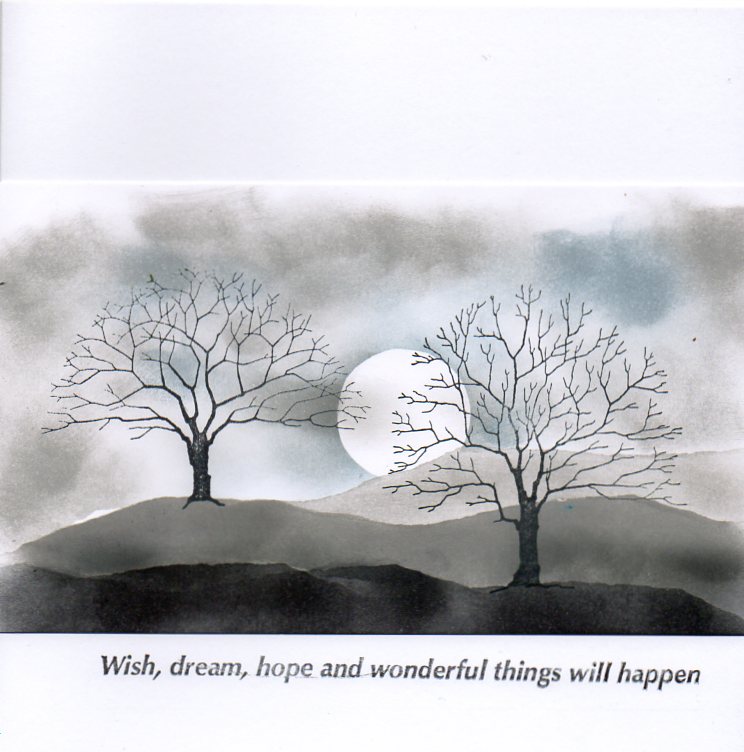
The second card I used a spare bit of white card and stamped the trees, then used sponges, black soot and hickory smoke distress inks and torn paper to create the landscape. The sky was also sponged using the hickory smoke again and broken china.Trimmed down again to fit across a card blank, then the sentiment from Life is so much better stamped below.
Monday, 24 May 2021
notelets

Friday, 14 May 2021
script scroll
Scripts and Timepieces and the Timeless stamp sets. - anything with script images is right up my street, so i loved these.
My first sample used the Scripts and Timepieces along with a window stamp from Gothic Fragments in the background. The background panel was inked with distress inks and stamped the large script and the window using the same inks.
I stamped the script panel on a separate piece of white card using a stamping platform. I inked the stamp up using the Koh-i-Noor marker pens , using the red pen for the initial flourish and odd words in the the script and black for the rest. Once it was dry I cleaned the stamp then inked the initial flourish using a versamark pen and stamped again - the stamping platform meant that it lined up beautifully - then embossed in gold. I tore the image out then inked round the edges before curling it up and over to look like a scroll and gluing onto the background.
The Timeless set for the second card, stamped twice onto white card in black and once in versamark and gold embossed. One black image was overstamped and gold embossed using a versamark pen and coloured with distress inks. Watch faces were cut out of the other images and decoupaged onto the main image, which was ddded to a distress ink background. The sentiment is from Say it Vertically
Tuesday, 4 May 2021
my world is full of colour
Last month's TV shows on the Craft Store channel for Chocolate Baroque featured some very different stamps, retro florals and retro vases, and these were some of my samples.
The first one used circles in different sizes and three very old multicolour ink pads. I started with the larger circle stamped once in the red part of the pad then surrounded by more circles in the orange. Trying to get a rainbow, I used smaller circles in the greens and finally in blues.

I used some of the solid shapes from the sets arranged on a stamping platform to make the other samples. The first card is a DL, with the stamps inked up using the blue multicolour inkpad and stamped straight onto the card blank.the the sentiment from Life is so much better stamped above.
I used the same panel this time coloured in rainbow colours using Koh-i-Noor marker pens onto a square of card, then added a sentiment again from Life is so much better stamped below. The background was inked with distress inks and a flower spray from retro florals randomly stamped using the same inks.
These stamps were exclusive to the Craft Store, and are available on the Chocolate Baroque page on the Craft Store website.