Showing posts with label clarity stamp. Show all posts

Sunday, 31 May 2015

shepherd's purse

Yesterday  was the Clarity east workshop with Janet Pring at Bawburgh, mainly using the new shepherd's purse stamp set.
This was the first card we made, masking off the central oblong, sponging with distress inks (milled lavender here), then stamping the word stamp with the masking tape still in place to create a background. Two of the stamps stamped over the top in black archival ink, seed pods coloured with pencils and I bleached out the colour on the flowers. Matching pink and green mats, and a fairly quick card to do - especially if you are like me and leave out the wiggly lines that Janet loves to add round the edges!
The following cards were actually done in the afternoon, using my current obsession, brusho - I was delighted to get the email mentioning this, and both Moira and I turned up with our own boxes of little pots, meaning that we got to make a lot more backgrounds than the others - we did share though!


 The one on the right is my version of Janet's sample card  actually, the left one I masked off the centre and added brusho to make the background to the stamp instead of inking as we did with the first card. The right hand one also shows the difference in colour when you blot the first piece of card with a second piece to get two for the price of one, I used the second print to stamp on.
This one I only used the black brusho powder, which gives a lovely muted multicolour effect.


The last two were actually done in the morning, and use a deer stamp and a couple of bullrush stamps from Janet's collection of foliage stamps.
The sample card was coloured with pencils and blending solution after outlining as landscape with a fine liner pen - not my scene at all! I used distress inks and the traditional torn paper to make my landscape, and coloured the bit below the deer stamp to look like water instead of leaving it white for a greeting as Janet had. I also sprayed some water over this bit and blotted it with kitchen roll. I did use the pen to extend the stamp to the side of the card to stop it floating in mid air between the rushes.

I did try the pencil technique - it was far quicker to use inks than pencils - and was not very impressed - probably I didn't use enough pencil in the first place as I couldn't get the blended effect I was aiming for in the sky: it did work a lot better with the water though, where I had used a lot more pencil. I cut this one down to fit a square card, which anchored the deer rather better - some of us did wonder about the designer's artistic licence in having two stags so close to each other and not fighting! Moira reckoned that they had fought and the one on the left had lost...............

Saturday, 16 May 2015

Sunday at Gissing


 Some of the cards from last Sunday at Gissing playing with Moira's Hobby Art stamps and Janet's Claritystamps - always a lovely time with crafty friends, , different stamps to play with , plenty of coffee,  cake and chat - what more could you want? One day I will actually remember to take a photo of all our cards, they all come out totally different!
This first one was right up my street, and uses distress inks, promarkers  to colour the larger leaves in , Hobby Art reeds and grasses stamp. Moira's sample version also used one of the birds - I left the bird out but stamped the feathery grass twice instead. I splashed water over the bottom part of the card and blotted it to try to give a watery effect


Being on a brusho kick at the moment I did a different more CAS version - I got the stamps first, so had time to play while everyone else caught up with all the inking for the background

Janet's sample used the new shepherds purse stamp from Claritystamp, with a masked and inked panel background done first.
I did two versions, one using distress inks and the stamp randomly stamped in a slightly darker yellow across the panel before removing all the masking tape and stamping the flower again in black archival ink across the panel. A wavy line round the edge of the panel and the flowers bleached out where they crossed the inked panel.
Second version used the brusho powders for the background, had to be careful not to over spritz the water to make sure the colour didn't seep under the masking tape.

Sunday, 8 March 2015

sundae club cards


Results of a peaceful afternoon at Gissing with Moira Walters and Janet Pring.
The first card was my favourite, using new spring stamps from Hobby Art. I went a bit mad with the masking, trying to create a field of daffodils in a valley in front of the church- as I eventually cut off most of the stems, could have saved myself a lot of fiddly cutting of masks if the idea of fussy cutting the border had occurred to me earlier!
Everything coloured with Derwent watercolour pencils.


Janet's card used chicks from Claritystamp- coloured using a mix of pencils and marker pens.
There isn't a mark on the card above the chick on the left, honest - obviously need to try to clean scanner!

Saturday, 4 October 2014

Diva Red part 1

Spent a wet day at Gissing with Moira , Janet and 5 other ladies, all happily getting inky.
This is the second of Moira's cards , and is a double-fold card - the front part was a ready-made card blank, with the back piece trimmed down and glued to another plain square card blank .
My camera is playing up , so these are scans.
I stamped the snowflakes from the Chocolate Baroque set a child is born, using Moira's multicoloured ink pad, then brushed cloud blue and juniper adirondack inks over the front.
The inner piece was a piece of water colour card coloured with  brushos (what else?)
I masked part of the card off first to give a snowy area, then used crumpled cling film and liquid pearls to dab in mountains,  sprinkled grey and turquoise brusho powders over the rest of the card, then spritzed heavily with water.
 Covered the wet card with more cling film, scrunched it up and left it to dry. Once it was dry, i used torn paper to sponge in the snow using the cloud blue and juniper inks again, then sprayed the sky with home-made glimmer spray using shimmer ink, water and isopropyl alcohol. Die cut deer added to the snowy fields, then the piece was matted onto silver card and glued to cover up the joined cards. We added acetate behind the cut out on the front, then added the diecut stag.
I will add the other card tomorrow once I get a decent photo, as no way will it scan - hopefully the weather will co-operate............
Janet's cards were much simpler -the one on the leftt was very quick, but very effective, using a Clarity stencil.
The stencil was taped down onto white card, then the blue and juniper inks were brushed through the stencil, and the darker bits sponged in. Once the ink was dry - I cheated and used the heat gun- we glittered the centre image - I used a white glitter that turned out to be mainly clear, so I went over part of the dove with a glue pen and added another glitter that claimed to be sapphire but looked more like an iridescent silver..........Matted onto grey card brushed with the blue and green inks, then onto silver before mounting onto a white card blank.
For the other card we used alcohol inks to create the background strip and the card used for the diecut poinsettia - I used latte, pest and rust, which came out rather paler than I was expecting. The strip of card across the front used 2 holly spray stamps, coloured with a mixture of inks and marker pens, trimmed down, matted onto a strip of gold card then onto the inked background strip before mounting on a white DL card. The poinsettia was held together with a brad, leaves curled slightly, then glued over the join of the two stamped images with glue gel.

Saturday, 30 August 2014

Clarity East again

 Clarity East again today with Janet Pring and we made 3 Christmas cards using the holly wreath stencil , two holly spray stamps and bauble stamps.
Scans of my versions of Janet's cards are not in the order we did them, as the top was the last one...........having managed to get them relatively straight on the scanner, I wasn't going to put them the right way round!
The long thin card in the bottom of the first scan was the first one - we stamped the large and small sprays diagonally across the card with black archival ink, and the small bauble on an extra bit of card and I coloured mine with ordinary marker pens. Janet had already die cut the gold and black layers for the bauble, so this was layered up and stuck across the join of the sprays. I brushed fired brick and bundled sage inks around the edges before adding a green mat before mounting onto the white card.
The blue card used broken china ink sponged through the wreath stencil to make the background strip. The large babuble was stamped in black archival again, and coloured with promarkers this time, matted onto silvery grey and pale blue card before adding onto a white card blank that had been stamped round the edges with the holly spray and sponged with the blue ink. Large bauble onto precut gold mount and added to one side.
The large square card used the holly wreath stencil run through a grand caliber to emboss the design first onto cream card before inking through the stencil with versamark. After removing the stencil, we used red and green perfect pearls to colour the stencil and also the greeting stamped in the centre.
The large holly spray was stamped in the corners and also round the edges of the white card blank. I didn't like the white base, so stamped it with the holly again and brushed the fired brick and bundled sage lightly round the edges to tone down the white, then on the corners of the cream panel to match it up a bit.

Saturday, 26 July 2014

Clarity East again

 A day playing with Clarity stamps was a good way to spend a very hot day, especially as there was a nice breeze through the open doors.
We used 3 stamps, crackle, urn and rose. The first card involved cutting a rectangle mask and stamping round it with the crackle stamp and black archival ink. We then stamped the urn, masked it off, stamped the rose spray so that it was coming out of the vase, then masked around the vase and overstamped it with the crackle stamp. Trimmed down to give 2cm borders from the masked area, coloured with promarkers and the vase clear embossed. Then matting l;ayers of black and green and some black card candi to finish.
This is straight on the card, just gave up trying to get it straight on the scanner!
I tried a variation using the swirls to overstamp the vase, coloured with watercolour pencils before clear embossing. I also stamped the swirls round the edge and sponged with distress inks before matting and layering onto a spare card blank.
The official second card involved cutting a circle mask using the new Christmas bauble stamps, then stamping the circle onto a square of white card, masking round it and stamping the roses in the centre. I coloured this with old paper and vintage photo inks, and also used these on the large background mat, which was stamped using the swirls part of the rose stamp in black and the crackle stamp in vintage photo.I did add a little glimmer spray to the centre circle.

 Our final card used gilding flakes, and this time was the only recorded time I have managed to use flitterglu without sticking myself to everything within reach!
The vase was stamped onto double sided adhesive, covered with acetate, then gilded on the back before being cut out. We stamped the roses using the flitterglu onto a strip of black card, then glued the vase into place before trimming the card down and gilding the edges - the brighter sparks among us used thin redline tape along the edges (not me!) and got a much better finish.
This was then stuck to a wider strip of black, torn at an angle along the bottom, and glued onto a tall thin base card - a very effective card.

Monday, 21 July 2014

Diva Red cards

 These are the cards I did yesterday with Moira and Janet at Gissing - far too hot to do anything but craft in a very leisurely way!
The first card was Moira's, inspired by Laura Williams (am sure Moira will correct me if I got the surname wrong) which has an acetate overlay - on mine it is far flatter than the original, which is how I managed to scan it.
The base card is 8" square, and the main panel is 7". The Sheena flower stamps were stamped with stazon and masked, then the background was done using distress inks on a mat, sprayed with water and mopped up - I used old paper, weathered wood and black soot, bit of an odd combo but I didn't have my box of ink pads with me, and that was what was available, and I really liked the result.

Once it was all dry, we used mildew cleaner (yes, I know, that was what we thought - would have been bleach but Moira had run out of it, and it does work!) to bleach out the flowers from the background. I coloured the leaves in with watercolour pencils after bleaching them.
More flowers were stamped onto the acetate with stazon again, then painted on the reverse with acrylic paints - despite the heat it took a time for the acrylics to dry, so we all ended up finishing off later at home.
The other card was based on one
  Janet
did a while ago using shaving foam  marbled card left over from a Clarity workshop, but we used alcohol inks on some new Chromo(?) card from Clarity, which is very shiny - butterflies are spellbinders dies, not sure about the seed head ones.

Sunday, 22 June 2014

Clarity East today

 Had a lovely messy inky day at Bawburgh with Janet Pring today (we all admired Janet's smart new apron) - still getting ink off my fingers!
We used Janet's set of distress re-inkers, filigraphy stamps and a couple of stencils throughout the day.
The first 7" sq cards involved putting drops of reinker onto a blending mat, spritzing with water then sponging through the block stencil - once that was dry, we sponged a palish ink through the flower stencil to give an indication of where to put the cut-out stamped petals and leaves. Yes, I believe the designer's  original  idea was to stamp over the stencilled image - you need very good eyesight and co-ordination to do this, way beyond us, so we trimmed the background card down to size then stamped, cut out and glued!
We used our own version of multicolour inkpads, mostly using the same reinkers we used in the background - I  did add stickles glitter glue over the flower petals (thanks Jeannette)- matt is a mid blue grey colour, not as dark as seems in the scan.
We had a set of stencils each, so I tried a different colour combination while waiting for the first one to dry, but used the distress ink pads and brushes - background was scattered straw and wild honey, and I stamped the flower with rusty hinge, and used spare leaves from the first card.

 The second card again used our DIY inkpads and some of the smaller stamps stamped randomly to create the background. We cut this up into 5cm wide strips, and I darkened the edges with stormy sky and dusty concord before matting them onto the purple card and adding flowers from Janet's collection. Sentiment stamped in dusty concord onto a strip of paper sponged with ink picked up from the DIY pads.
Our afternoon session was even messier - we had great fun with shaving foam marbling! Fortunately there was lots of spare card, as we all ended up with piles of backgrounds - all went swimmingly until we came to the stencil bit............. This involved putting the flower stencil over a sheet of card, the using a spreader to splodge the inked shaving foam through the stencil, scraping it off and leaving to dry before adding more foam to tint the background - well, that was the idea, and Janet had 2 lovely samples to prove it could be done........
The foam had other ideas, got under the stencil, splodged everywhere when we scraped it off - you name it, it did it!
we did eventually end up with sort-of ok in many cases, with a few people managing lovely clean prints to the great envy of the rest of us.
We edged the image with pens before trimming down and matting onto a marbled background and onto a white card blank.

Saturday, 7 June 2014

tranquility

 I fell in love with this Clarity Stamp stencil, and couldn't resist trying it out with the large stamp from the Chocolate Baroque tranquility stamp set, especially as the bullrushes sort of match!
The stencil is a 7"x7" two-part one, with an inner and an outer, and I used both - admittedly, the outer one was just to show the space I had to stamp in. I lightly pencilled round the inside of the frame on a 6"x6" piece of white card before removing the outer stencil and stamping the figure. I wanted a dreamy misty look, so used versafine smoky grey to stamp with, and watercolour pencils to add some colour to the statue. I was trying to get the effect of moss and lichen on an old statue. The background was sponged with distress inks, mainly broken china and peeled paint, and some foliage from the same set was added at the top. I then tried to match up the inner stencil over the stamped image and sponged round it with a mix of forest moss, tea dye and chipped sapphire inks - forest moss seems to have come out as the dominant colour, but the others are there.
A simple mat of green card before mounting onto a
white 8"x8" card blank.
The second version uses the same sizes, this time with a cream base card. This time I reversed the stencil and twisted it around so that the bullrushes matched better with the stamp, and stamped the image with butterscotch adirondack ink. I coloured the image with the same ink using a waterbrush and added touches of peeled paint distress ink, a more definite image and more resembling stone.
Background with distress inks in tumbled glass, peeled paint and faded jeans using inkduster brushes and the traditional torn copy paper.
The stencil was sponged round with tea dye ink for the bullrushes and forest moss for the rest, this time dragging some of the ink to the edges of the card.
Mounts were dull gold and green, card blank is a cream pearlescent - wording is a Penny Black stamp I found when rummaging in a sale bin at the last Thetford show, a bargain at 50p!

Wednesday, 4 June 2014

lots of owls


Since Moira introduced me to the Hobby Art owl stamps, I have become quite addicted to these cute little guys - and I don't normally do cute! Customers at the Country Market like them too, and they often go as quickly as I can make them, it does take ages cutting them out. They are all coloured with promarkers and on distress ink backgrounds.
Branches on the edge of cards are using a Clarity stamp stencil, and the tree trunks in the background of another are also from a Clarity stencil.
The woodgrain effect was done using a Sizzix embossing folder, inking it up with brown ink and then pressing a  sheet of paper over the top - I repeated this 3 times to cover an A4 sheet of card, so that I could cut out two 6"sq pieces. Distress inks in brown and green were randomly sponged on the card to create a weathered effect, then i used a small circle die to cut the nest hole out.
The cut out bit was sponged with darker inks, then glued in place on the base card - place the main piece of card on the base first, then glue the cutout into the hole to make sure it all fits properly. The big owl was glued onto the 'hole' piece, the the main piece of card glued down and the baby owls perched on the rim of the hole. Remaining big owl sits on a diecut branch from the Stampin Up bird punch.

Monday, 10 March 2014

owls....

 Spent nice afternoon with Moira yesterday, playing with her new owl stamps from Hobby Art - have to admit I drew the line at the fairies! Most cute stamps leave me cold, but these owls have great expressions - think exasperated depairing mum  for the big one - and I didn't really mind cutting them out.
The first one is my version of Moira's sample card - she kindly diecut the frame for us first. I used distress inks for the background, braqch stamped onto the background and coloured with promarkers, owls cut out and glued on top. I slit each side of the branch and slid - eventually- the wing through for the dangling owl.  I brushed more distress ink round the edges of the frame before adding mum on foam pads and a gold matt.
I had a Clarity Stamp stencil in my bag which I had been using when playing with tags for the latest Chocolate Baroque tags challenge, so used that for a background for the second card. Blue and green distress inks brushed over fairly lightly through the stencil, then again after removing the stencil to tone down the white of the tree trunks.
Branches and small owls stamped directly onto the background, coloured with promarkers. The  branch and large owl stamped on spare card, coloured and cut out - I used the branch upside down - and stuck on with pinflair gel. Matt is a dull silver this time.
Both cards are white 6x6 blanks.

Sunday, 9 February 2014

getting inky

Barbara and I spent a happy afternoon at Gissing today, getting inky with Moira and Janet, and these were the cards we made.
Moira had just received a set of the new Sheena embossing folders, and had ready embossed one on white card for us to play with.  We inked the embossed deign with distress inks, and we all ended up with very different effects, ranging from my dark one ( I do seem to be hooked on night scenes at the moment, maybe I have some vampire blood somewhere!)  to Jill's light springtime version. I lightened the sky with a waterbrush round the dragonflies, then added some wink of stella to them as well, and also to the lantern. To me, a lantern in the tree means night -time , but I did stretch a point towards a setting sun. There was  a lot of black soot sponged around the edge of the design to make it a bit more dramatic.
 Janet's card used a Clarity aperture stencil and a large stamp - a very quick card to make, fortunately as we spent so much time chatting and drinking coffee that we were running out of time!
Much to Janet's shock, I actually followed her design and colours - she's threatening to mark the date in her diary...........this was using a 7" square base card.
Mind you, I had time to stamp another image, and to revert to normal before our hall time ran out! Back to more normal, with the image stamped in black archival ink, and another sunset sky. It was cut down to fit onto a 6" square card once I got home, matted onto dark blue.

Monday, 2 December 2013

sporty masks

 Saturday was the last Clarity East workshop of the year, and Janet had chosen a stencil and sports stamps as the base of the day. . The top card is the first one we did, brushing distress inks over the stencil then stamping into the spaces. We used the full size of the stencil, 7x7", which was mounted onto green card in my case then onto an 8x8" card base.
As a change from masculine cards, we made the thank you card using the same stencil, embossed onto linen card before inking through the stencil in rather more feminine colours this time. The stencil was just cut into 2 strips about 4x11 cms, mounted onto toning card and then onto a 7x7" base card which I brushed with lilac inks first, the word panel was stamped in purple archival ink on colour-brushed card to match the stencilled pieces, then covered with versamark and clear embossed.
In the afternoon we went back to masculine cards, and made the golf card, using post-it note masks for the figures. I even did the wavy lines round the figures like I was supposed to..................think Janet is still suffering from shock!
I always have white card with me, knowing that I seem to work faster than everyone else, so I got 2 alternative designs done to finish off later - very useful, as I couldn't decide which sport I was going to use!
 It was  a lovely day, and we even had a raffle as Barbara had kindly sent Janet some goodies, and Iwon a set of stamps - sketched lady, Eiffel tower and a very nice corner stamp - now I need the Paris skyline mask to go with them.


Wednesday, 11 September 2013

Diva Red

 I don't normally get to any of the Diva Red workshops, but did manage the morning last Saturday, and these cards are the result.
I had to scan them both, as the weather is too lousy for the camera - and the birdcage is meant to be hanging straight down, not squiffy, but I ran out of patience fiddling with the scanner!
The birdcage was Moira's card, and took quite a time to do - and I don't think she has recovered yet from seeing that I did what I was told to do! (mind you, the fact that this session was held in the village hall and all Moira's stash was not available probably had a lot to do with that). it started out as a triple fold card, and the first double fold was cut using a spellbinder die and a grand caliber - this suffered from cutting through 2 layers of heavyweight card, so much so that it got really hot, and will probably have to end up in diecut hospital - which definitely took musclepower.
The front of the card and the insert were both stamped with a Clarity leafy swirl stamp, with a greeny embossing powder used on the front and perfect pearls on the insert. Birdcage was a Marianne die, butterflies spellbinders embossed with an embossabilities stencil, not sure where the swirl die came from. Hopefully Moira will blog the correct details sometime
Janet's contribution was the Christmas card using a Clarity stamps - the colour combination was right up my street, and it would be a very easy card to batch make; details are on Janet's blog, so you are spared my version of how to!

Sunday, 11 August 2013

Clarity east

 Yesterday was a Clarity East workshop run by Janet - I think this was about the fourth one Janet has run, but the first that I was able to go to, and these are the card we made. As there was quite a lot of us, we split into 2 groups - one doing birdhouse cards, one Christmas with the holly tree. The Christmas ones were the more complicated, and I don't think anyone actually finished both cards in the time we had...........
My group started with the birdhouse stamp and the matching set of small stamps, and a rather nice floral stencil for the background (so nice one came home with me). We had a large selection of distress and adirondack inkpads to choose from, and I lazily used mostly the nearest ones, so my stencil background was mainly done in frayed burlap distress ink, with a dash of spiced marigold and and stonewashed. We cut the stencil down slightly, mounted it on black card, then on pearlescent white card base.
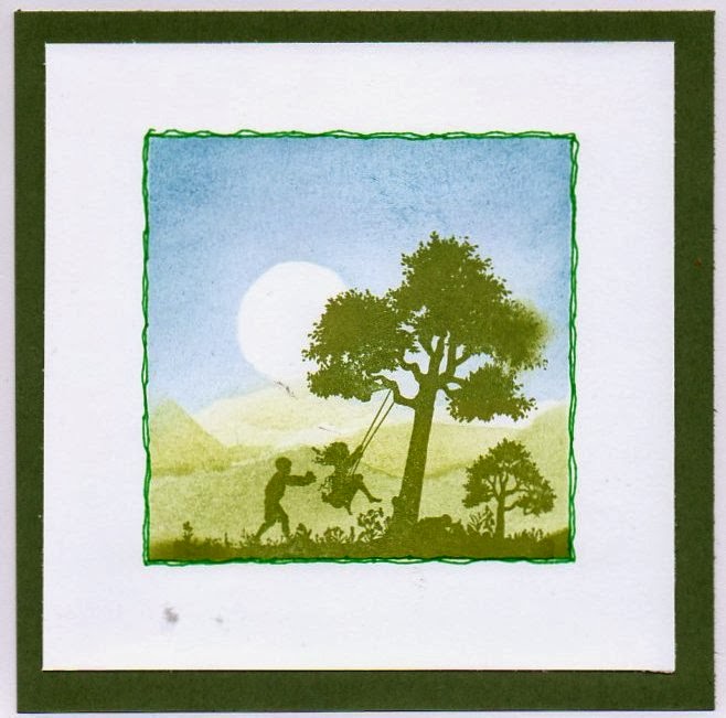
 The scene was stamped in black archival ink across a strip of white card before we added a moon and sky - sky was lake mist, tattered rose and mountain rose, with a bit of olive and peeled paint for the ground. Strip again on a thin mount of black card, trimmed at the sides to match the background layer.
Second card is all masked, and looks surprisingly dimensional when done................ We cut a mask for the centre first, and stamped the border around the edges using the leafy stamp from the set - I used frayed burlap again, with tattered rose and lake mist. Then we masked the border off and created our central scene - i used the same colours again, plus some mustard seed for the sun. I did the background first, using torn copy paper to make the hills, then put my birdhouse dead centre just to see if it would work.
 As some people didn't make it, I was one of the lucky ones to have a set of stamps to myself, so I had time to stamp another scene before lunch, and this is it.......using the leafy stamp to create tree branches, with stonewashed and mountain rose for the sky and lake mist for the ground. I put the cat in front of the birdhouse, as I thought he was a bit out of proportion anywhere else - when I got home I mounted this onto a 5.5" square of black card, then onto a 6x6" white card base.
In the afternoon we finished one card completely using the holly tree stamp, and most of the second card.
We stamped the holly tree onto white card, gold embossed it, coloured with perfect pearls, then cut it out. The background card was brayed in the corners with bottle and cranberry inks, then the holly sprays were stamped with versamark ink and dusted with perfect pearls. Holly tree stamped and embossed again in the centre, trunk painted then the cutout tree glued on top before mounting onto red card mat and a white card base.
The second card is still in pieces - hopefully Janet will have blogged it as it should have looked - mine is awaiting a nicer stamp to use in the centre of the two embossed and resist panels of holly at the sides ----------sorry, I really don't like the holly tree, so am still looking for a similar size replacement.................

Monday, 10 June 2013

doing different

Yesterday was our monthly crafty session at Moira's, and we were all very glad of the heater glowing in the corner as it was a very dull and dank day, though it didn't actually rain.
Moira had found a new to us technique involving alcohol inks and laminating folders  - splashes of inks on the inside of the folder, add gilding flakes, close up and run through the laminator. Stamp a flower stamp with versamark and emboss with black EP on the resulting plastic sheet, flatten quickly with a block, then cut out the flowers and arrange round a diecut stamped sentiment.
Quite simple - until I tried it! Everyone else produced a perfect mixed multicoloured sheet - I got a streaky inky mess..............which looked like a rather lurid underwater scene to my rather desperate eyes. Moira produced a sheet of fish peeloffs,
 and I stuck 2 of the fish onto white card, coloured with promarkers, cut out and glued onto the more underwatery bit of the piece of plastic, along with 3 bits of waterweedy peeloff at the bottom. the fish was coated with dazzling diamonds, which I later regretted, as they took ages to dry........
the card on the right is more what I should have done .
I dug out my inks when I got home - or rather the 4 that I could find - a laminating folder and got going. I added mica powders as well as gilding flakes - it took 3 tries with different laminating sheets to get something approaching a decent result - obviously some makes work better than others, as on 2 of them the inks just slid off the plastic. I used an orphan Chocolate Baroque stamp for the flower, and the EP is a mix of odds and ends of blue and green - sentiment is a Clarity stamp of Moira's. Base card is white pearlescent, mat is vanilla, which doesn't show up too well on the scan, as I had to adjust the colours to get the flowers to look reasonably true.                                                            
 The remaining 2 cards did come out rather more as they should have - apart from me using white EP on grey card rather than black on white card, with the addition of white craft ink on the second card.
Sorry for the squiffy scans, I gave up after I had carefully lined them up with the edge of the scanner 5 times and still got a crooked image............
allium stamp is another Clarity one.
Moira promised to blog her originals soon, so I will be able to see how different my home version turned out.............it's not a technique I will be using a lot, it took ages to clean the rollers of the laminator!