Monday 27 December 2010

guild card swap

 Every Christmas there is a card swap in the Graphicus Guild - it means we each get a lovely handmade card, but also a lot of anguish trying to do something special for our swap! I had lots of wonderful ideas that didn't work, and eventually ended up doing simple. the stamp was from the New England plate by Elusive Images, coloured with watercolour pencils with added glitter in places. The overlay idea was swiped from Tim Holtz - if you're going to swipe an idea, you may as well go for the top!- who embossed packaging plastic for one of his 12 tags of Christmas series this year - I think the packaging I used was a little thick, but it worked, though  I had  a little trouble gluing it down with glossy accents........The bp was a freebie from Glenda Waterworth, and the lh strip was cuttlebugged and glimmer misted, no idea which glimmers though as I did it ages ago.
The second card is the beautiful one I received from Val, with a lovely misty forest background - have a look at her blog, it's well worth it!

I hope everyone had a happy Christmas, and I wish you all a very prosperous crafty New Year

Tuesday 30 November 2010

brown, grey and silver

 The Playdate cafe challenge this week has been for cards in brown, grey and silver - not having done any challenges for some time, I was determined to do one, and the early snow here has helped as traffic was backed up past here most of yesterday due to accidents on the main road, so going out meant walking, which I am not a great fan of in snow!
This card is actually the second effort, and uses a stamp from  the Elusive Images 'New England winter' plate, which I had had for a few weeks and not got around to using.............Just stamped using vintage photo distress ink, ink brushed out with a waterbrush; image cut out and mounted onto a bit of cuttlebugged and glimmered card (it is much greyer really, the scan is very much bluer than in real life) torn and edged with silver EP - the silver EP was also dotted onto the tree by the house. The bp is from my Graphicus Guild pack, and the white card remaining was coloured with DIs in old paper and black soot  .     The second card was the first attempt, stamp was borrowed from a friend, and I think was from Personal Impressions - anyhow, stamped in vintage photo, clear embossed, torn out, mounted on a piece of torn brown paper, then glued at an angle across a grey gatefold card. The inner fold of the uneven gatefold was covered with a piece of the cuttelbugged card, and a silver strip of punched snowflakes (Martha Stewart) added to the larger side.

Tuesday 16 November 2010

mica stencils

 At our last craft get-together Moira passed on a technique she saw demoed by Dot from the Stamp Hut at the recent Suffolk Papercraft show in Bury St Edmunds - basically stamping with versamark through a stencil, embossing with stamp'n'bond powder, then dusting with mica pigments (through the stencil? -I didn't see this, as there was almost always a huge crowd round Dot, and she had moved on to other things when we eventually got to see late afternoon)
 Being Moira, she thought it would be simpler to emboss the stencil first, which is what we tried. Being me and born awkward, I had to choose a large stencil - I thought I had something at home that would just go in the centre - well, if I did, I haven't found it yet! Still, I was quite pleased with the result - it probably doesn't show too well on the scan, but the base card is a dark green, with mica in autumn colours over the leafy swirls. I did several versions before the stencil got too filthy, and one has actually made it to a card!!! The base of this one was blue, and the mica was basically the leftovers from the others, mostly a mix of gold and silver. Having had a pre-Christmas present of a
big shot, I treated myself to the Tim Holtz tattered
 florals die. I cut it out several times in various gold cards, layered it up with a green cutout  and added it to the centre of the frame, and it just fitted.
The samll gift tag was more the sort of stencil everyone else was using, and I was quite pleased with the snowy effect using white and green mica, with a gold for the moon.
Maybe now Pauline and Moira will stop complaining about how bad a blogger I have been lately! (sorry ladies, couldn't resist that).

Monday 18 October 2010

halloween 2

When looking for more beads in my local Range store, I found some readymade diamond-top cards in black -just right for more halloween cards - and no, I couldn't find the beads! I used the same stamp from Elusive Images as last time, but this time stamped on to a freebie paper from Glenda Waterworth last year. I copied an idea of Glenda's by adding a coat of gesso to the prrinted paper to get a misty effect, then stamping onto this with versamark and embossing with black sparkly Wow EP. I coloured one bat in in black on the background, as it was orange originally, then sponged round the edges with black soot DI.  The image was mounted onto a dark grey mirri paper, then onto black  card bfore mounting across the diamond top. The same paper was printed out on draft to get a simialr misty effect, stuck onto the base of the card, then the word was stamped along the bottom, using two different SeeD alphabet sets that have been lying around for ages, and consequently losing letters....................the edges were again inked with the black soot DI.
I am entering this for 2 challenges, from Moving Along With the Times  68 (halloween) and Corrosive Challenges 86 (no white).

Thursday 7 October 2010

spooky

I was lucky enough to win the twilight zone set of stamps on the recent Elusive Images design team bloghop, and had great fun getting very inky at the weekend! I used distress inks in old paper, milled lavender, dusty concord, faded jeans and black soot all applied with sponges, and a post-it provided the mask for the moon.  The black cat was embossed with a sparkle black EP. The base card was stamped round the edges with the tree bit of the main stamp, using versamark dazzle - I picked this pad up in a sale bin, and I can't see that it does anything different to an ordinary versamark pad ! - then the large bat was stamped randomly in the trees as well.

Tuesday 14 September 2010

winter dawn


The playdate challenge this week is for black and white, with a choice of  copper, gold or pink. I went for the pink, and ended up with this tag.
I started by sponging my only pink DI over the white tag - as this was tattered rose, it didn't have much zing, so I carefully blended in some fired brick to give it a bit more impact. Black soot then went all around the edges, with several applications to get it dark enough. The tree stamps are from Elusive Images, and the small trees were stmaped with black soot after stamping-off onto scrap paper first. The main image was stamped in black memento, then clear embossed so it stood out a bit more - I then sponged more black soot around to try to give a landscape effect, ending up with very little white left.  I used white inkessential pen to highlight the base of the trees and a few of the branches, then added dots of crystal glitter on the leaves - the dots of glitter are rather larger than I would like, aas the replacement for my quickie glue pen does not have such a fine nib.


spooky candy

Fancy some Halloween stamps? Check out the Elusive Images design team blog this week for a chance to win, and to see the fab samples

Tuesday 7 September 2010

challenges

 The first card is for Playdate challenge 45 - the colours this week were more to my liking, but I found it hard to use the maroon and ended up using it as the base card, a bit of a cheat I know! The tag got the DI treatment, using old paper, marmalade, brushed corduroy and photo inks, overstamped with an Artemio script stamp in marmalade. The trees and words came from Elusive Images- I used small trees in the background, in marmalade - they aren't terrbibly obvious, but they are there! the taller trees were stamped in brushed corduroy, which has come out nicely fawny and the words in black memento. Backing paper from Essence of Nature cd by Artylicious, and I used a couple of punched swirls to 'hold' the tag in place
When bloghopping I found that the Stamp Man now have a challenge site as well, up to no 4 with a musical theme - very timely, as I found this stamp when having a bit of a clear-up, from the very first set of atamps I bought from the Stamp Man long ago. It was stamped on white card with vintage photo DI  and more DI was rubbed around the edges. I stamped again and embossed with copper EP, cutting the butterfly and dragonfly out and adding colour with marker pens before gluing them over the original. Backing bits were from stash, also unearthed from the depths - have no idea what I coloured the embossed bit with now, but DIs probably came into it! The flower is from a pack from Woodware

Monday 6 September 2010

dreaming

This was the card I did for the Graphicus Guild  'green with envy' album for those of us on the forum who could not go to the paradise weekend - after it was finished I realised that it would fit Cynthia's latest challenge very nicely.
It started as a beige DL card. with a download image from Craft Stamper transferred using nail varnish remover on an ink-jet print and a lot of rubbing down with the back of a spoon. I then sponged the card fairly randomly with DIs, starting with old paper and shabby shutters. After roughly masking out the face, I overstamped with a script stamp from Artemio in shabby shutters. I then used Elaines's leafy technique again to fill in the rest of the card using shaby shutters, peeled paint and bundled sage. the flourish stamp from Elusive Images was stamped in forest green, and the same shade was used around the edges of the card. The words came from a sheet of foiled words from Graphicus, which also got the leaf treatment before being matted onto gold mirri card.

Tuesday 31 August 2010

playdate 44

The challenge for Playdate 44 was to use hot pink, navy blue and mustard yellow - I was stuck for ideas until I remembered this stamp from Elusive Images.  I sprayed the back ground with glimmer mists - can't tell you which ones, as I did three versions, I just dug out all the relevant colours and got messy! far as I can remember, this one used 2 each yellows and pinks, a red  and a blue - I added the red as none of the pinks was really a 'hot' one. The image was stamped in black versafine, clear embossed, and the lettering coloured with a marker pen as the paper was a bit too pale at that end.  A very bright pink paper that came in a mixed pack made the bakground, stamped with an Artemio stamp in faded jeans DI - the flower is prima, and the base card is navy blue.
Hopefully the next challenge will have nicer colours!

Saturday 28 August 2010

blog candy

There is some lovely candy up for grabs! Jak has some, closing 3rd September; also Val until 8th September - why not pop over there and drool?

Tuesday 24 August 2010

butterfly

I've been quite hooked on leafy backgrounds lately, and as they have mostly been greeny, thought one would fit the Playdate 43 challenge, which was to use lime green, dark green and blue. I stamped the butterfly from the Elusive Images patchwork butterfly plate in versafine black, clear embossed it, then painted it with a mix of H2O and cosmic shimmer paints - I used the nearest to lime green I had, which was more of a goldengreen on the paper, plus a turquoise and a dark green to paint the butterfly. The sentiment from the same set was stamped onto a nestie shape, edged with DIs in greens- I think peeled paint and forest green.
This is also for Rainbow Lady challenge 115, which was 'paint'.
Sorry the scan is squiffy, the 8"x8" base card is a dull gold - but it came out better than the photo.

cats

The 'big black one' as Nimbus was known by the neighbours was unfortunately hit by a van at the beginning of the month, and sadly did not survive the meeting. As there was a cat-shaped hole around, OH and I took a trip to back to Venture Farm - we didn't find a cat there that wanted us badly, so went home to think about the possibles. Then we had a call to say that a cat had been returned, please go look - cut a long story short, we now have Bibble, a pretty little tabby aged about 7. She is the original scaredy-cat at the moment, having had somewhat of an upsetting time over the last few months - in fact, the day we brought her home, she hid for 8 hours! She is improving, will now sleep in the dogbed (Nimbus didn't fit a cat one!), comes for strokes, but is still very nervous although she has plucked up enough courage to go outside.

Thursday 19 August 2010

grungy brocade 2

This is a very simple card, so I can show off the leafy background I made following the instructions on Elaine's blog - I had tried to copy this without a whole lot of success before Elaine revealed exactly how she did it, and the 'right' way is a lot simpler than what I was trying to do! DIs used were old paper, shabby shutters, peeled paint and forest green - and I found that smaller leaves worked better than big ones, and fresh was better than ones that had been sitting around for a while.
Image from the grungy brocade plate from Elusive Images, stamped in corduroy DI , clear embossed and coloured with watercolour pencils this time.

Monday 16 August 2010

grungy brocade

This was not what I started out to do, I blame it all on the weather -it has been miserable here today, grey and drizzly all day, more like October than August!
Anyhow, what was going to be nice, cheerful and green ended up being grungy and brown - all was not lost, as not only did I need more 'man' cards but I decided that it would fit the Playdate challenge  42 colour scheme of dark brown, green and beige - admittedly with very little green, but there is some there!
Base card is dark brown, cuttlebugged strip dark beige (sanded to show the white), background paper from Artylicious, flowers by Prima. The stamp is from the grungy broacade plate by Elusive Images, which I have had some time but not used very much - stamped on beige card in vintage photo DI, clear embossed, then coloured with more vintage photo using a water brush. Edges were rubbed with more of the same ink on a baby wipe, then edged directly with the ink pad.
I used the sketch from Moving Along With the Times - very loosly admittedly, so adding it for that challenge as well.
ps - according to my ruler, everything is straight - it doesn't look it though!

I made the top 3 at MAWTT- wow!!

Tuesday 3 August 2010

essence of nature

 The long-awaited new cd  from Glenda Waterworth  Essence of nature  is now here - and I had to try some of the backing papers out!
The first card is for Playdate 40, where the colour scheme is for black/white/hint of green - fortunately, there is a lovely muted colours folder on the cd, with a greeny/grey misty trees image which fitted in beautifully (the photo comes out rather brighter green, it didn't scan well as the silver grey came out very dark grey mud colour). The image was embossed in detail black, butterfly pained with H2Os, and the poppy heads coloured with pencils highlighted with an inkssentials white pen.
Second card used an alternative image I had thought of using for playdate, but coloutred the poppy heads in brighter tones. the butterfly is using 2 layers of fantasy film. The film was was in tones of blue and golden green, but they both came out more purply.....the greeny gold in the top layer does show up in sunlight though.........backing paper again from the cd, but a brighter colour scheme, more autumnal shades - I can see this cd getting a lot uf use, I already have a small stack of printed papers rady and waiting to be used..........
All the stamps used are from Elusive Images - butterfly poppy plate and patchwork butterfly plate

Tuesday 27 July 2010

playdate 39

 Whilst searching for a particular stamp for another project, I came across this Elusive Images stamp from a few years ago - while it came from a Christmas plate, I often use it as it is a lovely image and my Christmas roses did  NOT flower at Christmas, more like September/October (before they gave up on me), and the ones just labelled hellebores flower in spring ...............
I loved the colours chosen for the new Playdate challenge, so decided to have a go using this stamp. I originally intended bleaching out the image, but wouldn't you know it, the beige card I had won't bleach out. Second thoughts, so I coloured most of the image with Inktense pencils, then painted the actual flowers with H2Os (oyster, heavenly white and g          gold  opal) - not sure that this shows up too well on the scan though.
I tore the image out, then sponged over the edges with old paper and  brushed corduroy DIs, matted onto glossy white and black card - the torn black card was edged with pirate gold EP to add a bit of bling. The embossed backing card was also given the DI treatment with the same inks

Saturday 24 July 2010

felted flower

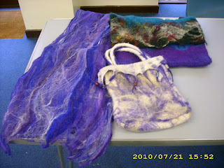
Having seen felted flowers on several blogs recently I was quite pleased to find that the speaker at my WI meeting this week was talking about felting. The photo shows some of the samples she brought to show us different ways of felting - the blue scarf was very tactile and delicate, not at all what I expected felt to be like!  The bags  are actually seamless, something I am all in favour of as I am useless  at sewing. We all had a chance to play at needle felting afterwards, although only 4 of us did so while the rest watched in anticapation of us stabbing ourselves with the (very sharp) felting needles.......fortunately, I chose red wool which didn't show the blood!
I rashly tried to make a flower, and actually was quite pleased with how it turned out,  although in no way does it resemble an actual flower apart from having petals and leaves! It was quite fun stabbing away at the wool, can see that it would relieve a lot of tensions if you christened the wool as something (one?) that was bugging you..............
Let's just say that thanks to Sue Percival our speaker I left clutching not only my 'flower' but a bag of assorted wool, 2 felting needles and a polystyrene block...............and two small purple petals are the start of another flower.
I think I shall have to invest in a small canvas so that I can use my creations - or alternatively next month's WI competition is for a decorated hat.....................

Tuesday 13 July 2010

second thank you card

 I used the sketch from corrosive challenges for the second school thank-you card. The green card was edged with DIs in bundled sage and peeled paint, and the grasses on one side from the eastern grasses plate by Elusive Images were stamped with the sage DI.The greyish backing paper from Graphicus Guild was sprayed with glimmer mist in green.                                              The tag started out sponged  with DIs on old paper and peeled paint, then the grasses image was stamped in versamark, clear embossed, sponged with peeled pain, then the versamark ironed off. More grasses were stamped in peeled paint and black soot - tag sprayed with water to blur the black image. When it was dry, the cow parsley stamp from the wild meadow plate by Elusive Images was embossed in white twice at the bottom of the tag. The butterfly image is from the patchwork butterfly plate -also Elusive Images -embossed in black and painted with Artquest jewel mica metallic paints.

playdate 37

 There was plenty of colour choice in this challenge, and I chose  tan, green and red, and used the poppy image from Elusive Images - to me, poppies are summer, and I am sure there are plenty in Provence!
The base card is tan, edged with DIs in bundled sage and forest green - backing papers from Graphicus Guild paper pack. My friend Moira kindly lent me her wizard and nestie dies to cut out the poppy and its frame - was quite impressed with the nesties, not quite so much so with the wizard firing the plates out at me though!

 The poppy stamp was embossed with pirate gold EP on to white card sponged with DIs in old paper, bundled sage and forest green, and coloured with Inktense pencils.
This card will be the first in a  series of thank-you cards for staff leaving school at the end of term.

Friday 9 July 2010

transfer tag

I managed to watch Barbara Gray on C&C last Sunday - she demoed image transfer using nail varnish remover and an inkjet print - sounded interesting and cheap to do, so I looked for nail varnish remover on Monday morning. Think half the population must have had the same idea, took ages to track down some remover, eventually found some in small local supermarket, purely by accident! Anyhow, after several tries, this was the best I managed - either too much remover, didn't rub hard enough/ too hard - possibly the fact that I use water-resistant ink in my Epson printer may not have helped either. Image came from the Craft Stamper website, but I only used the face - to be honest, was a bit fed up by then!
My current favourite DIs were sponged round the image - spiced marmalade, rusty hinge, fired brick and vintage photo- then overstamped with a flourish from Elusive Images and the flower freebie from Craft Stamper. The butterfly came from Inca stamps, stamped on acetate  with gilding flakes on the back - dragonfly from Elusive Images, crystal glitter on acetate.
Think I shall have to move on to blues and greens - the weather is far too hot at the moment, and maybe if I use cooler colours the weather may follow....................

Tuesday 15 June 2010

playdate cafe 33

 ATCs are not normally my cup of tea, but that was the size that fitted this stamp from Elusive Images- and the only raspberry card I had wasn't big enough for a card base anyway!
The image was stamped in black versafine on white, clear embossed and painted with a mix of H2O and cosmic shimmer paints; mounted on a  scrap of white, then over a torn and inked scrap of calligraphy background paper from the bits pile- think it originally came from Crafthouse Press, but it was so long ago that it had lost any label it ever had. the wall background has come out rather orange in the pic, but it is actually rather browner, even if not quite the kraft that Playdate wanted

Tuesday 8 June 2010

blues

A card for 2 challenges this week - the theme of 'faces' for Rainbow Lady's challenge 106, and the sketch from Moving along with the Times challenge 49.
I am still playing in Tim Holtz mode, but different colours this time -the background used weathered wood, old paper, shabby shutters and faded jeans DIs, with the faded jeans the most obvious one. The background started off using an Impressabilities flourish as a stencil, with the two palest DIs. Stamps used were by Elusive Images - script  and face from the art girl plate, and a small flouish from the with sympathy plate. The script was stamped with faded jeans, the girl with black memento ink - the flourish was sprayed with water and stamped round the edges, then blotted to remove some of the ink.
The background paper was from the Guild paper pack, and the prima flowers had their initial  colours changed with more faded jeans sponged on fairly heavily. Martha Stewart punched strip also got the ink treatment

Monday 31 May 2010

more tags


Playing with my new stamps from Elusive Images - keys and words from key to my heart plate amd the flourish from with sympathy plate; background script from Elusive Images butterfly poppy plate again, and the small script from an old  Stamp Man plate (can't remember which one).
The first two started out with a flourish glimmer mist stencil inked round with tattered rose DI, then overstamped with the script stamps in spiced marmalade. The flourish from the sympathy plate was stamped using brushed corduroy - edges were sponged with brushed corduroy and vintage photo. Words and keys were stamped with tuxedo black memento and embossed with clear EP- on the second tag the words were stamped onto a separate bit of glossy card sponged with marmalade and stamped with the flourish in tattered brick, then edged with vintage photo. The keys were painted with H2Os.
The second set used the same stamps with slightly different DIs - a base of old paper this time, script stamps in marmalade and flourish in corduroy again. The keys were stamped, embossed and painted as for the first set.
All I need to do now is decide what to do with them!

Wednesday 26 May 2010

tagging along


Had a weekend off, so had time to play, which for me usually means tags - they're a nice size, and always useful, as they can be turned into a card or a bookmark. Anyhow, these are the results so far, haven't decided what will happen next yet.
The first three all had a similar back ground of distress inks, old paper and peeled paint, and stamps are by Elusive Images unless I say different! The one on the left was stamped using eastern grasses with peeled paint, allowed to dry  (I spoilt 2 by going too fast, it takes a long time for DI's to dry enough to emboss over them!) and then overstamped with the large stamp from Wild Meadow embossed in detail white EP, wioth the Irish prayer by Clarity Stamps added in black soot.
The centre one had a background from eastern grasses again, then a Hampton Art poppy stamp stamped with a green memento ink (bamboo?) and clear embossed. I added more distress ink in marmalade and fired brick over the poppy and round the edges, and more peeled paint over the leaves. Butterfly from the butterfly poppy collage plate, painted with Art Quest metallic paints (couldn't find the H2Os).
The last one had the background grasses stamped in versamark and clear embossed before inking around to give more definition.I ironed the EP off, added more green ink over part of the grass, stamped more grasses in black soot, and sprayed with water to blur it all. Same wild meadow stamp in white over the top, then another butterfly
The next two started out using a big'n'juicy pad in I think spice, with stamps from wild meadow and autumn hedgerow as background. I found a guild bird stamp whilst looking for the H2Os, so stamped and embossed this over the background - in photo for one and black soot for the other. The birds didn't really show up, so they got several  doses of bleach before the tag waas trimmed down to the edges of the stamp.
The last two tags started out with  old paper DI   , then the text stamp from the butterfly poppy plate in versamark, then brushed corduroy DI over the top. I didn't emboss the versamark, so the stamp is very faint in the far background. Grasses for wild meadow, and autumn hedgerow for thwe next layer, then the butterfly poppy image clear embossed over black soot. The poppy heads and leaves got the H2O treatment - they may yet end up with the butterfly!

Friday 2 April 2010

more challenge cards

 Two very sinple cards - the first is for Rainbow Lady's challenge 97 - through the window- , to include a window  (obviously).  I had just finished colouring this digi image from Mo Manning with promarkers when I checked Cynthia's blog - just right for this week! The mat is a textured pale pink, the usual gold/silver just didn't seem to go, and the bp is from a magazine freebie.
The second card is for a new- to- me blog cardsformen, where challenge 7 is for a card with humour. This image comes from a stamp plate I won from Particraft sometime ago - decided I really ought to use more of the stamps, although manyof them  were not really my scene - which led to the card here, which I decided wasn't really bad after all!  The image is stamped with versafine, coloured with promarkers. Backing is a textured gold card from payperbox, and the bp is from my Graphicus Guild pack - am sure it is on one of Glenda's cds, just haven't looked for it specially.

Tuesday 16 March 2010

playdate20

I had to decorate a box for my WI meeting this week - decided to use the Playdate colour theme, as it fitted nicely with the colours on the Artylicious decadent brocade CD..........the box originally held cheese, and I covered it in the green paper, then added distress ink round the edges -(peeled paint) and round a glimmer mist swirl stencil. The flowers were stamped on scraps of paper ((mostly from the same cd)  from the poppy collage plate from Elusive Images, assembled with brads. The leaves were cut from another sheet of paper, with the edges rubbed with peeled paint again

Thursday 11 March 2010

city girl

This is the last of the Whiff of joy stamps I bought at Thetford recently - followed a sketch on the WOJ challenge site i discovered the other day. Ideal for my daughter's birthday card, as it includes an IOU for her present (clothes shopping session) - don't think she reads the blog, but she should have the card by now anyway. Used my new Martha Stewart punch as well - really impressed, as it goes through quite sturdy card.
Background papers by Artylicious, stamp coloured with promarkers, and the bags are decoupaged using oddds and ends of papers
Everything is straight on the card, it just looks squiffy - honest!

the Valium card!

This is the card that drove us all mad last Sunday at our regular get-together at Moira's - she saw a similar one on C&C TV, worked out how to recreate it, and proceeded to drive us all crazy! We all innocently turned up with the requested 4 sheets of A4 card - asembling the basic card wasn't too bad - the square back is 6x6, with  2 pieces of A4 cut down along the length to measure 6" deep, then scored at 4.5" and at 7.5"  to form the gatefold bits...........the rest was eventually stuck behind the original square to make the base card. The stamps used are all from the Elusive Images wild meadow plate, stamped in smoky grey and black versafine on silver card - the back piece was slightly smaller than the base square, then the 3 strips in front were cut from across the narrow side of A4 (if that makes sense) and trimmed along the stamped edges. OK so far, then the 'fun' started...............the 3 stamped strips had to be fitted into slits cut in the 3" wide fold behind the front gatefold.....and the slits had to match on both sides ................and the printed owl (from the Jayne Netley Mayhew cd) on its strip of acetate had to go through yet another slit..................oh, and all the strips had to have a stopper bit at each end to stop it sliding completely out, which didn't help getting them through the slits in the first place ........and any sharp edges on the strips stuck anyway..................
We had to admit that the result was great - but I'm convinced there must be an easier way to get the same effect - I just haven't worked it out yet!
Sorry for the photos, will try to get a better one later

Saturday 27 February 2010

journal cover and cute

Seeing journals on blogs reminded me that I had bought at least one sketchbook with good intentions last year............feeling guilty I rooted around and found one, still pristine and totally untouched. I felt that at least I ought to do something about the nice white cover, even if it never got any further - I felt that the colour scheme for PlayDate Cafe 18 was quite appropriate for something that would be quite likely to gather dust for some time before being touched again! I applied large quantities of black soot distress ink, then stamped the bird's tails around the edges - then attacked it with baby wipes to lighten everything up. The text from Tim Holtz was stamped with versafine onto white card, torn out and rubbed with more black soot DI - I went over two words with white gel pen, then added clear gloss to some of the words. The bird cage is from Elusive Images, as are the birds themselves. I had intended to use birds stamped on blue tissue paper, then stupidly stuck them down with the wrong glue - white glue shows through tissue paper! I hurriedly ripped them off, substituting birds on blue card - to hide some glue I couldn't get off, the larger bird had to go on a tag - black soot again, with another image from Elusive Images stamped in white stazon and then coloured with a promarker.

I don't normally do cute, but fell in love with some Whiff of Joy stamps at the Sincerely Yours Thetford show recently - felt that Iought not to buy them, having spent a small fortune on promarkers, but decided that if they were still on the stand after lunch, then they were mine! Needless to say, there they were .................I bought 2 of the city girls, and a sweet mother and baby. They were both stamped with versafine, coloured with my new promarkers - backing papers from Artylicious and flowers from rarely used stash. I went over the dress of the dancer with a clear sakura pen to give it a bit of glitter. The punched strip uses a Fiskars punch - saw a lady demoing MS punches at the show, and was very impressed with the results she got punching both sides of a strip- she was using a half-flower punch, and ended up with a strip of whole flowers, which looked great - the punches had sold out, so resorted to trying something similar with my one and only border punch - can't think why it never occurred to me to try this before! - result nothing like with the MS punches, so they are now on the wish list, although behind the new Elusive Images stamp plates of eastern grasses and keys...............

Sunday 31 January 2010

playdate 14


The Playdate Cafe challenge 14 has a colour scheme of lilac, dusky pink, orange, dark green and white this week - not one I would have chosen! However, I suddenly realised that these were ideal for the Elusive Images peacock stamps when looking for a bp for something else on the Artylicious Peacock Summer Party cd...........I found this orange/pink/lilac paper, so dug out my stamps.

The peacock was stamped onto dark green card, embossed with Ranger seafoamwhite ep, then coloured with orange mica powders and a sakura pen also orange. Matted onto white card, then onto lilac card folded to make an easel fold - the narrow 'ribbon' is leftover from another sheet
printed from the same cd, also matted onto white. The 'stops' for the easel bit are acrylic flower stickers I found when making a start on tidying up...................

This card also fits for the fancy folds challenge 48 on Corrosive Challenges