Patchwork butterfly for Chocolate Baroque colour challenge 35 - sadly this will be the last of the monthly colour challenges.
I found a box of elderly glimmer mist sprays recently, and surprisingly some still worked, luckily including purples and greens.... I sprayed an A4 piece of white card with two of each colour, then cut it down to 6.5" square, choosing the bit with the least blobs on it.I stamped the lovely Irish blessing and the large butterfly from patchwork butterfly and embossd with gold EP.
I had previously brushed mica powder over the butterfly stamp for an earlier project, and there was still some mica left on the stamp,so I covered it with pearl soft form relief paste and left it to dry.
The result was very pastelly, and too pale, so I rubbed some very elderly wax over the raised areas before gluing it over the stamped butterfly image - I thought he would look better with his antenna!
The base card is white 7" square.
Showing posts with label challenges. Show all posts
Wednesday, 24 May 2017
Sunday, 21 August 2016
shaving foam
When I saw the latest challenge from The Male Room, I was having a break from attempting to restore some sort of order to my craft space, and had just unearthed some backgrounds made during a brusho/shaving foam playday earlier this year.
This one got a reprieve from the binbag, as I fancied it looked like a turbulent sea, and it went with a previously unused stamp from Crafty Individuals.........
The shaving foam had just been sprinkled with blue and green brusho powders and swirled round without adding any water, and the powders spread in streaks when the shaving foam was scraped off.
The stamp was stamped separately on white card with black versafine, clear embossed, and coloured with some ancient H2O paints, cut out and added with foam pads. I cut out the wording, added to to scraps of the same blue card I used for matting and then to the top of the brusho card/
Base card is a 15x15 cm white.
I am entering this for the Male Room challenge 42 - use shaving foam
and Addicted to Stamps and More challenge 207 - make your mark
This one got a reprieve from the binbag, as I fancied it looked like a turbulent sea, and it went with a previously unused stamp from Crafty Individuals.........
The shaving foam had just been sprinkled with blue and green brusho powders and swirled round without adding any water, and the powders spread in streaks when the shaving foam was scraped off.
The stamp was stamped separately on white card with black versafine, clear embossed, and coloured with some ancient H2O paints, cut out and added with foam pads. I cut out the wording, added to to scraps of the same blue card I used for matting and then to the top of the brusho card/
Base card is a 15x15 cm white.
I am entering this for the Male Room challenge 42 - use shaving foam
and Addicted to Stamps and More challenge 207 - make your mark
Wednesday, 27 April 2016
CB challenge 22
For my DT sample for the Chocolate Baroque colour challenge, I used 2 stamps from the butterfly poppy A4 sheet of stamps - another older set which was a firm favourite a while ago, (I really loved the combination of poppies and script) and which fitted the colours.
For the first card, the main image was stamped in black versafine onto white card and clear embossed before colouring with promarkers. The white 15x15cm base card was stamped in opposite coners with the small script stamp using whild honey distress ink before adding the butterfly image on an orange mat.
The second card was stamped with black versafine again, and coloured with pencils, giving a much paler image. The script stamp was stamped all over the 5"x7" white base card in wild honey ink before matting the butterfly onto a paler orange card.
For the first card, the main image was stamped in black versafine onto white card and clear embossed before colouring with promarkers. The white 15x15cm base card was stamped in opposite coners with the small script stamp using whild honey distress ink before adding the butterfly image on an orange mat.
The second card was stamped with black versafine again, and coloured with pencils, giving a much paler image. The script stamp was stamped all over the 5"x7" white base card in wild honey ink before matting the butterfly onto a paler orange card.
Labels:
butterfly poppy,
challenges,
distress inks,
pencils.
Thursday, 7 April 2016
butterfly notecards
Whilst sorting out stamps, I came across these DL stamps - cut out, mounted but never used............I vaguely remember seeing Glenda demonstrating the kiss technique with them on Create & Craft many years ago, and at the time they were a must have! Much to my surprise, they are still in the Chocolate Baroque listing, butterfly blush for the solid images and just butterflies for the matching linear images.
The challenge this week on Make my monday is watercolour, so I decided to christen these stamps by trying the kiss technique with water-based marker pens.
I chose the largest image from each set, and randomly coloured the base stamp with 3 or 4 different marker pens. The matching stamp was then sprayed with water and placed over the solid image and pressed firmly.
This image was then stamped onto small 4" square card blanks - being cautious, I wsn't too sure it would work, and didn't want to ruin a larger card!
The result was a watery mix of colours, and I was quite happy with the result even though the linear image didn't always show up too well.
The cards on the right show both images stamped onto white card - and also where I haven't lined the two stamps up perfectly!
I now have a set of small note cards which will be very useful for those quick thank-you notes
The challenge this week on Make my monday is watercolour, so I decided to christen these stamps by trying the kiss technique with water-based marker pens.
I chose the largest image from each set, and randomly coloured the base stamp with 3 or 4 different marker pens. The matching stamp was then sprayed with water and placed over the solid image and pressed firmly.
This image was then stamped onto small 4" square card blanks - being cautious, I wsn't too sure it would work, and didn't want to ruin a larger card!
The result was a watery mix of colours, and I was quite happy with the result even though the linear image didn't always show up too well.
The cards on the right show both images stamped onto white card - and also where I haven't lined the two stamps up perfectly!
I now have a set of small note cards which will be very useful for those quick thank-you notes
Wednesday, 21 October 2015
October postcards

October postcards for the Chocolate Baroque potpourri challenge - had to use the colour this month which was heather, and this is what I eventually came up with. Have to admit that I spent a lot of time searching for two particular stamps that I still haven't found in the disaster area that is officially my daughter's bedroom - even more disaster than normal as a good part of the contents went to a WI craft day, and still haven't made it back to their allotted homes....
Fast running out of time, I decided to make landscapes using the terrific treescapes set of clear stamps (these seem to be no longer available, which is a great pity as there are some very useful trees there), the now traditional torn paper and brushes and sponges. Inks used were victorian velvet, milled lavender and dusty concorde distress inks and Stampin Up concorde crush.
These would also seem to fit the challenge 167 at addicted to stamps and more, which is make your mark.
thanks Judith and Lesley for letting me know that the stamps will be back on the website soon - just out of stock at the moment! Look out for terrific treescapes, CBCL 0009
Thursday, 8 October 2015
angel
Got quite hooked on this Chocolate Baroque colour challenge - this one uses a brusho background and the angel from last year's Christmas set a child is born.
Background just uses grey brusho powder on watercolour paper (I found out that watercolour paper doesn't cut neatly on a trimmer - at least, my variety doesn't - which accounts for a few slightly wobbly edges). The angel was stamped onto white card, gold embossed and coloured with pencils. Fussycut out, glued down, and glitter added to the wings.
Mats are black, pearlescent silver,black, and the base card is pearlescent gold.
Background just uses grey brusho powder on watercolour paper (I found out that watercolour paper doesn't cut neatly on a trimmer - at least, my variety doesn't - which accounts for a few slightly wobbly edges). The angel was stamped onto white card, gold embossed and coloured with pencils. Fussycut out, glued down, and glitter added to the wings.
Mats are black, pearlescent silver,black, and the base card is pearlescent gold.
Sunday, 4 October 2015
challenge 15 again
another quick Chocolate Baroque challenge entry, this time using a stamp from terrific treescapes, and another sponged background.
Base card is 6x6 , and it is clean, spots are from scanner!
No greeting as I haven't decided what it will be for yet......
Base card is 6x6 , and it is clean, spots are from scanner!
No greeting as I haven't decided what it will be for yet......
challenge 15
very quick post with an entry for the Chocolate Baroque colour challenge
Very simple, image stamped in black versafine, then the star sponged in yellow, sky in grey - base white card is A5
Saturday, 11 July 2015
CB challenge 12 - again - again!
Another entry, again a get well card for a WI friend, this time using a stamp from pretty poppies and the same Crealies patchwork die and sentiment stamp. Thanks to Lesley for identifying the stamp - have used the others from this set lots of times, but never this one before!
Flowers coloured with promarkers and fussy cut. Background circle stamped with same stamp in grey ink, edges of everything inked with an ancient apricot inkpad.
Really enjoying playing with this borrowed die, waiting for mine to arrive
Flowers coloured with promarkers and fussy cut. Background circle stamped with same stamp in grey ink, edges of everything inked with an ancient apricot inkpad.
Really enjoying playing with this borrowed die, waiting for mine to arrive
Friday, 10 July 2015
CB challenge 12 - again
Another card for the challenge - many thanks to Moira for selflessly lending me her Crealies patchwork die!
Poppy stamp is one of my favourites, from this old set , which happily is still available - the words are from this set. The Crealies die is not in stock at the moment, which is why I bribed Moira with cakes!
Sunday, 5 July 2015
chocolate baroque challenge 12
Colour challenge this time was to use red/russet, orange, green and grey - like a lot of people, the first 3 colours shouted poppy at me!
Easel card, base card and poppy 'stop' are die cut.
Stamp is from the pretty poppies set, stamped with black versafine and clear embossed onto a brusho background, then coloured with a mix of karisma and spectrum noir pencils.
Am hoping I may get another entry done before the deadline
Easel card, base card and poppy 'stop' are die cut.
Stamp is from the pretty poppies set, stamped with black versafine and clear embossed onto a brusho background, then coloured with a mix of karisma and spectrum noir pencils.
Am hoping I may get another entry done before the deadline
Thursday, 18 June 2015
brusho poppies
have been playing with the new poppy stamps from Hobby Art and my brushos, and these are the results so far.
For both cards I stamped the images first in black memento on white card for the square and multimedia paper for the oblong. Both pieces were sprinkled with the same brusho colours - brilliant red, leaf green and yellow - and heavily spritzed with water. I spread some of the red out with a paint brush where it didn't spread by itself to cover the poppy heads.
The effect on the multimedia card is far smoother and more diffuse, and the card itself didn't curl up, so I think I will be using it more often now .
The same poppy stamp was inked with marker pens and spritzed with water before stamping to form the background on the 6x6 square card, and the main image was matted onto black.
Matted onto black again, and also onto a matching red card then onto a 5x7 white
base card
The theme for the Hobby Art challenge this month is seaside, so this is my effort using my one and only seaside stamp -sorry for the slightly squiffy scan, scanner is playing idiot at the moment and refusing to show the white border unless I back the card with another colour to scan it and crop it later....
Anyhow, i used the harbour stamp, in black versafine onto multimedia card and clear embossed. A circle mask for the moon, then brushed chipped sapphire and black soot distress inks across the sky, and the main part of the image.
I darkened parts of the scene with karisma pencils in indigo and black, using a promarker blender pen to spread the colours round a bit and smooth them out. White pencil to highlight the houses, then matted onto black, silver and blue card.
For both cards I stamped the images first in black memento on white card for the square and multimedia paper for the oblong. Both pieces were sprinkled with the same brusho colours - brilliant red, leaf green and yellow - and heavily spritzed with water. I spread some of the red out with a paint brush where it didn't spread by itself to cover the poppy heads.
The effect on the multimedia card is far smoother and more diffuse, and the card itself didn't curl up, so I think I will be using it more often now .
The same poppy stamp was inked with marker pens and spritzed with water before stamping to form the background on the 6x6 square card, and the main image was matted onto black.
Matted onto black again, and also onto a matching red card then onto a 5x7 white
base card
The theme for the Hobby Art challenge this month is seaside, so this is my effort using my one and only seaside stamp -sorry for the slightly squiffy scan, scanner is playing idiot at the moment and refusing to show the white border unless I back the card with another colour to scan it and crop it later....
Anyhow, i used the harbour stamp, in black versafine onto multimedia card and clear embossed. A circle mask for the moon, then brushed chipped sapphire and black soot distress inks across the sky, and the main part of the image.
I darkened parts of the scene with karisma pencils in indigo and black, using a promarker blender pen to spread the colours round a bit and smooth them out. White pencil to highlight the houses, then matted onto black, silver and blue card.
Sunday, 14 June 2015
CB challenge 11
The current colour challenge over at Chocolate Baroque, and this is my version, using brushos (what else? sorry,am a bit addicted!) and the butterfly thistle stamp.
Monday, 18 May 2015
Chocolate Baroque challenge
A very quick post for the Chocolate Baroque challenge 10 to squeak in just under the time limit!
As is so often the case, the longer time I have to do something, the longer it takes me to actually do it - if it is needed tomorrow, fine , next week is more problematical, daft isn't it?
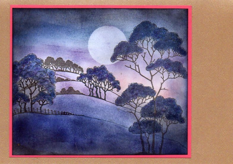
Anyhow it took me a while to find something approaching the required colours especially since my long-neglected glimmer mists mostly refused to co-operate, so it was back to distress inks. The search for the glimmer mists (put away neatly in a drawer, most unusually!) also turned up a long neglected set of stamps, patchwork landscape.
One of this set got a lot of use, so it was way past time for some of the others to see ink for the first time.
I eventually stamped both images in black versafine, then used a variety of ink pads and sponges to create the landscape, mostly dusty concord, chipped sapphire and black soot. the trees were coloured with dusty concord dabbed on with a cotton bud, then painted over with chipped sapphire using a water brush. A few dabs of white pen and a wash of clear wink of stella to try to catch the moonlight on the foliage, trunks coloured with marker pen.
A narrow mat of bright pinky purple card to give a bit of fizz, then mounted onto a base of pearlesent cappucino card
As is so often the case, the longer time I have to do something, the longer it takes me to actually do it - if it is needed tomorrow, fine , next week is more problematical, daft isn't it?
Anyhow it took me a while to find something approaching the required colours especially since my long-neglected glimmer mists mostly refused to co-operate, so it was back to distress inks. The search for the glimmer mists (put away neatly in a drawer, most unusually!) also turned up a long neglected set of stamps, patchwork landscape.
One of this set got a lot of use, so it was way past time for some of the others to see ink for the first time.
I eventually stamped both images in black versafine, then used a variety of ink pads and sponges to create the landscape, mostly dusty concord, chipped sapphire and black soot. the trees were coloured with dusty concord dabbed on with a cotton bud, then painted over with chipped sapphire using a water brush. A few dabs of white pen and a wash of clear wink of stella to try to catch the moonlight on the foliage, trunks coloured with marker pen.
A narrow mat of bright pinky purple card to give a bit of fizz, then mounted onto a base of pearlesent cappucino card
Tuesday, 28 April 2015
new stuff!
Had a quick play with some new stamps from Chocolate Baroque - not really brand new, but new to me! Also had to try out the Spectrum Noir pencils that I just had to get after trying out one of Janet's set at the last Clarity East workshop.........there's just too much temptation around these days, leaving aside the question of the really new CB stamps, like the luscious orchid............
Anyway, I started out with the fountain scene stamp, versafine black ink and a spare piece of brusho'd card - luckily the trees came out onto a greener bit of card, purely accidentally!
I bleached the fountain out, and tried the bleach on the dome and top storey of the building, but the blue resisted the bleach.
I did manage to get a bronze effect on the dome using the pencils. The trees and edge of the fountain were also coloured, and the colour under the arch was deepened as well.
Matted onto dull silver, then onto blue card stamped with one of the stamps from gothic fragments in versamark and clear embossed. Actual card blank is 5"x 7".
I am linking this to the current Addicted to stamps challenge, which happily is anything goes.
The second stamp was the February year of stamping image, tulips, just right for really trying out the pencils. Not wanting to go too mad, I just got one set of pencils to really try out, and have to say that they do work well so far, haven't tried anything really fancy with them yet. Downside is that one set really limits the colour choices - really prefer the better mix of shades in my watercolour pencil sets!
The white tulips had a coating of clear wink of stella , and greeting came from a magazine freebie stamp set. this is a 6"x 6" card blank.
Anyway, I started out with the fountain scene stamp, versafine black ink and a spare piece of brusho'd card - luckily the trees came out onto a greener bit of card, purely accidentally!
I bleached the fountain out, and tried the bleach on the dome and top storey of the building, but the blue resisted the bleach.
I did manage to get a bronze effect on the dome using the pencils. The trees and edge of the fountain were also coloured, and the colour under the arch was deepened as well.
Matted onto dull silver, then onto blue card stamped with one of the stamps from gothic fragments in versamark and clear embossed. Actual card blank is 5"x 7".
I am linking this to the current Addicted to stamps challenge, which happily is anything goes.
The second stamp was the February year of stamping image, tulips, just right for really trying out the pencils. Not wanting to go too mad, I just got one set of pencils to really try out, and have to say that they do work well so far, haven't tried anything really fancy with them yet. Downside is that one set really limits the colour choices - really prefer the better mix of shades in my watercolour pencil sets!
The white tulips had a coating of clear wink of stella , and greeting came from a magazine freebie stamp set. this is a 6"x 6" card blank.
Labels:
brusho,
challenges,
chocolate baroque,
Spectrum Noir
Friday, 1 February 2013
one for the boys
this weeks challenge on Make my Monday is 'one for the boys' - I had originally intended to use ships, then finished off this card started at craft club instead.........
Base card is a 6x6 pearlescent dark brown, matting layer a dull silver.
Stamp from the SU feeling sentimental SAB set, stamped on white card with black versafine ink - edges torn and inked with brown versafine, then sprayed with SU vanilla shimmer smoosh spray. The backing was using an idea of Moira's - having bought a lot of bargain tissue paper, then you have to use it! -a 5x5 square of card was sprayed with adhesive, then covered with crumpled tissue paper - black in this case - swiped with a versamark pad then embossed with lava black EP, with another spray of smoosh spray.
No sentiment yet - I much prefer adding that when I know who will be getting the card.............
Base card is a 6x6 pearlescent dark brown, matting layer a dull silver.
Stamp from the SU feeling sentimental SAB set, stamped on white card with black versafine ink - edges torn and inked with brown versafine, then sprayed with SU vanilla shimmer smoosh spray. The backing was using an idea of Moira's - having bought a lot of bargain tissue paper, then you have to use it! -a 5x5 square of card was sprayed with adhesive, then covered with crumpled tissue paper - black in this case - swiped with a versamark pad then embossed with lava black EP, with another spray of smoosh spray.
No sentiment yet - I much prefer adding that when I know who will be getting the card.............
Thursday, 10 May 2012
white flower
This is the first time for ages that I have managed to take part in the Make My Monday challenge - this month the theme is florals, and this week they wanted lily of the valley or white flowers.
I don't have any lily of the valley stamps, but I do have this lovely lace flower from the new Chocolate Baroque lace fragments stamp set that I was itching to try out!
I also wanted to try the faux patina technique from Splitcoast Stampers, so got inky fingers and put them both together.
The flower was stamped in versamark and embossed in detail white onto SU crumb cake card, roughly torn out round the image and the edges inked with vintage photo DI - and I carefully added a very little ink onto the centre of the flower using a cotton bud.
The faux patina background starts out with an embossing folder - I tried several, and the ones that worked best were the cuttlebug harlequin pattern I used here and the SU vintage wallpaper, which both have smallish overall patterns that are fairly deeply embossed. The folder was inked with SU crumbcake ink before embossing, so you have an embossed white image on a pale background - I embossed twice to get a large enough piece of card. The card was then inked all over with distress inks, starting with tumbled glass and peeled paint, ending with vintage photo. After a few hours drying on a storage heater, I dabbed a versamark pad over the card, and embossed with detail gold EP - the random effect does mean that the background got a bit inked too, but it looked ok.
I used a white 5"x7" card blank, with a mat of SU chocolate chip card under the embossed panel.
I don't have any lily of the valley stamps, but I do have this lovely lace flower from the new Chocolate Baroque lace fragments stamp set that I was itching to try out!
I also wanted to try the faux patina technique from Splitcoast Stampers, so got inky fingers and put them both together.
The flower was stamped in versamark and embossed in detail white onto SU crumb cake card, roughly torn out round the image and the edges inked with vintage photo DI - and I carefully added a very little ink onto the centre of the flower using a cotton bud.
The faux patina background starts out with an embossing folder - I tried several, and the ones that worked best were the cuttlebug harlequin pattern I used here and the SU vintage wallpaper, which both have smallish overall patterns that are fairly deeply embossed. The folder was inked with SU crumbcake ink before embossing, so you have an embossed white image on a pale background - I embossed twice to get a large enough piece of card. The card was then inked all over with distress inks, starting with tumbled glass and peeled paint, ending with vintage photo. After a few hours drying on a storage heater, I dabbed a versamark pad over the card, and embossed with detail gold EP - the random effect does mean that the background got a bit inked too, but it looked ok.
I used a white 5"x7" card blank, with a mat of SU chocolate chip card under the embossed panel.
Labels:
challenges,
chocolate baroque,
cuttlebug,
distress inks,
faux patina,
stampin up
Saturday, 14 January 2012
MMM31 -animals
A very last-minute card for Make My Monday challenge 31 - animals. I got this lovely Jayne Netley Mayhew stamp of a siamese cat from Joanna Sheen as part of a Christmas voucher spend, and had to try it out. Very simply stamped in black versafine onto white card, cut out with an Xcut die and inked round the edge with SU crumb cake ink while still in the die.The markings on the cat are also crumb cake, applied with a cotton bud, eyes coloured with promarker. The mat using the next size up die was SU baja breeze card, darkened with baja breeze ink. The DP was a digi download, from Lesley Wharton many moons ago -have just checked her blog, and it was May 2009 -doesn't time fly! Mats are crumb cake and baja breeze card, and the white edges of the base card were sponged with baja breeze, as the white was too harsh.
Wednesday, 7 December 2011
Christmas housemouse
I spent a happy afternoon at the weekend watching tv and cutting out meeces, finally deciding to use this pic of two snoozing meece. I matted it onto some green glitter card, added a bit of glitter to the snow on the roof, mounted it onto a square card over a square of snowflake paper from the Artylicious Seasons Greetings cd (from Chocolate Baroque, there may still be some in stock). The snowflakes were from a Sizzix die, cut from white card (wouldn't you know I didn't have any white glitter card ?) then glittered with Art institute crystal glitter - I now have a glittered carpet as well after dropping the tidy tray I was using ............and will probably soon have a glittery cat, as there is bound to be some I missed still there.
Now to start using up the others I have cut out................
Labels:
artylicious,
bah humbug,
cd sunday,
challenges,
housemouse,
Joanna Sheen,
make my monday,
sizzix
Thursday, 1 December 2011
fabric flower
This is a rather late entry for Bah humbug, where Ann and Max wanted something using fabric - I thought I had some glittery fabric, couldn't find it, so dug out the felt and net I bought ages ago to try out with the tattered florals die. I cut one layer in felt, several layers in different nets - afraid they all look the same colour in the shot, but there are actually 4 different shades in there somewhere - and layered them up, adding a chipboard circle triple embossed and stamped with a poinsettia stamp from an old Elusive Images set. Leaves are paper from the tattered leaves die, and all mounted on a box created from the Sizzix top note die from Stampin up
Am also linking this to the craftroom challenge, for flowers, thanks to Kate !
Labels:
bah humbug,
challenges,
elusive images,
sizzix,
stampin up,
Tim Holtz
Subscribe to:
Posts (Atom)