I had used odd sheets of card in colours I didn't like to try this out, two being yellow and orange, which gave me the idea of trying to make flowers out of the resulting leather-look card, especially as I had used an old cuttlebug folder with a leafy branch design. I used the Tim Holtz tattered florals and tattered leaves dies, and ran the flower shapes through different folders before inking with distress inks. The one that ended up on the first tag began life as yellow, embossed with a cuttlebug flowery folder, inked with spiced marmalade and vintage photo. The second version waas orange, with a Tim Holtz music design folder, inked with spiced marmalade and rusty hinge inks. the green leaves were left crumnpled, and inked with peeled paint and bundled sage.
Tuesday, 25 February 2014
faux leather tags
The March challenge for the Chocolate Baroque tag swap is to use a faux leather technique, and Margaret supplied us with instructions for two different ways.
The first tag uses a masking tape technique, where you cover a tag randomly with torn pieces of masking tape, make sure they are well stuck down , then sponge with ink - the edges of the tape pick up more of the ink, and you end up with a patchwork effect. Once it is inked to your taste, cover the whole tag with versamark and clear emboss. This was very easy to do - I did have to buy some more masking tape, as my very elderly reel was definitely non-stick, and I got some strange looks sitting at market ripping masking tape - and they didn't get any less strange when I had explained what I was doing!
The second technique was one I saw demoed on tv by Sheena Douglas, but hadn't got round to actually trying it, or even printing out the instructions...........this one was dead easy, and gave a great suede-like effect. Basically, you spray a sheet of card with a mix of water and glycerine, rub it in, then repeat on the other side, the crumple it all up and squeeze out any excess liquid - if your card was like mine, there won't be any. Repeat the process, then leave to dry. Once dry, cut out the tag shape, run through an embossing folder, ink as desired and decorate if wished.
I had used odd sheets of card in colours I didn't like to try this out, two being yellow and orange, which gave me the idea of trying to make flowers out of the resulting leather-look card, especially as I had used an old cuttlebug folder with a leafy branch design. I used the Tim Holtz tattered florals and tattered leaves dies, and ran the flower shapes through different folders before inking with distress inks. The one that ended up on the first tag began life as yellow, embossed with a cuttlebug flowery folder, inked with spiced marmalade and vintage photo. The second version waas orange, with a Tim Holtz music design folder, inked with spiced marmalade and rusty hinge inks. the green leaves were left crumnpled, and inked with peeled paint and bundled sage.
Sunday, 9 February 2014
getting inky
Barbara and I spent a happy afternoon at Gissing today, getting inky with Moira and Janet, and these were the cards we made.
Moira had just received a set of the new Sheena embossing folders, and had ready embossed one on white card for us to play with. We inked the embossed deign with distress inks, and we all ended up with very different effects, ranging from my dark one ( I do seem to be hooked on night scenes at the moment, maybe I have some vampire blood somewhere!) to Jill's light springtime version. I lightened the sky with a waterbrush round the dragonflies, then added some wink of stella to them as well, and also to the lantern. To me, a lantern in the tree means night -time , but I did stretch a point towards a setting sun. There was a lot of black soot sponged around the edge of the design to make it a bit more dramatic.
Janet's card used a Clarity aperture stencil and a large stamp - a very quick card to make, fortunately as we spent so much time chatting and drinking coffee that we were running out of time!
Much to Janet's shock, I actually followed her design and colours - she's threatening to mark the date in her diary...........this was using a 7" square base card.
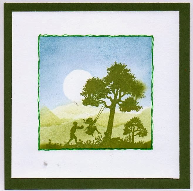
Mind you, I had time to stamp another image, and to revert to normal before our hall time ran out! Back to more normal, with the image stamped in black archival ink, and another sunset sky. It was cut down to fit onto a 6" square card once I got home, matted onto dark blue.
Moira had just received a set of the new Sheena embossing folders, and had ready embossed one on white card for us to play with. We inked the embossed deign with distress inks, and we all ended up with very different effects, ranging from my dark one ( I do seem to be hooked on night scenes at the moment, maybe I have some vampire blood somewhere!) to Jill's light springtime version. I lightened the sky with a waterbrush round the dragonflies, then added some wink of stella to them as well, and also to the lantern. To me, a lantern in the tree means night -time , but I did stretch a point towards a setting sun. There was a lot of black soot sponged around the edge of the design to make it a bit more dramatic.
Janet's card used a Clarity aperture stencil and a large stamp - a very quick card to make, fortunately as we spent so much time chatting and drinking coffee that we were running out of time!
Much to Janet's shock, I actually followed her design and colours - she's threatening to mark the date in her diary...........this was using a 7" square base card.
Mind you, I had time to stamp another image, and to revert to normal before our hall time ran out! Back to more normal, with the image stamped in black archival ink, and another sunset sky. It was cut down to fit onto a 6" square card once I got home, matted onto dark blue.Wednesday, 29 January 2014
Eastern promise
I was trying to create a Chinese-style landscape scene behind my Buddha - not too sure how successful it was, but definitely mountains! All the stamps are from Chocolate Baroque, and the scenery is all created using brushes, distress inks and torn paper masks - lots of fun..
I stamped the buddha figure first, coloured with inktense pencils, then with a versamark pen and clear embossed it. Mountains are black soot distress ink, with tree stamp from teeny weeny meadow peeking out in places. The same tree stamp was used in the meadow-type bits, and the large single tree was part of a stamp from terrific treescapes coloured with marker pens. Wisteria stamp in the foreground also comes from the tranquiility set along with the buddha, and was stamped using 3 different green inkpads.
I am entering this for two challenges,
Make my Monday - Eastern promise
Craftascene - make your own theme
I stamped the buddha figure first, coloured with inktense pencils, then with a versamark pen and clear embossed it. Mountains are black soot distress ink, with tree stamp from teeny weeny meadow peeking out in places. The same tree stamp was used in the meadow-type bits, and the large single tree was part of a stamp from terrific treescapes coloured with marker pens. Wisteria stamp in the foreground also comes from the tranquiility set along with the buddha, and was stamped using 3 different green inkpads.
I am entering this for two challenges,
Make my Monday - Eastern promise
Craftascene - make your own theme
Sunday, 26 January 2014
vaseline resist

I meant to add these to the last post, but blogger wouldn't let me add more photos to the first post.......
The vaseline resist was far easier than the crackle, and so far these are the samples. Very layered colours in the background, as the first efforts didn't work - not enough vaseline and too thin paint, and I was too impatient and wiped it all off before the paint had dried...............
With more layers of vaseline and thicker paint, and far less impatience, it worked fine and I stamped and embossed the words with versamark and white EP.
**!!/ crackle!
February's technique tags are more variations on the resist theme, with crackle effect and vaseline resist being the chosen variations.
The crackle recipe involved painting the tag with dilute PVA, overpainting with acrylic paint and blasting with a heat gun.
Now Margaret had some lovely crackly samples she sent with the instructions - did I get artistic crackles? NO - what I got looked like the tags had some dread alien disease! The top 3 scans are the best of them, full of bubbles and blotches, but I think they may possibly be rescuable eventually with an image glued on top.............

Number 4 worked beautifully, much to my amazement - then I ruined it by not checking the embossing powder carefully. I found that it was possible to stamp with versamark over the acrylic and emboss, but you needed a very heavy hand with the anti-static powder first. I used an ivy stamp from the christmas foliage plate, embossed first in distress EP weathered wood, then in an anonymous green EP from a box of donated EPs. That was fine so far, but the ivy didn't really show up, so I decided to fill-in the design with a versamark pen and add gold - only snag was I chose a cosmic shimmer from the same box , which turned out be very pale and practically invisible - that'll teach me to test strange EPs first on something else!
I then risked using one of the better failures , and found that the bubbles didn't like being stamped over, although using the more solid version of the ivy stamp worked better, and the word stamp embossed well with a 'known' pirate gold EP.

The final version was stamped using green stazon, which gave a much better effect, although the crackle isn't as good on this tag
The crackle recipe involved painting the tag with dilute PVA, overpainting with acrylic paint and blasting with a heat gun.
Now Margaret had some lovely crackly samples she sent with the instructions - did I get artistic crackles? NO - what I got looked like the tags had some dread alien disease! The top 3 scans are the best of them, full of bubbles and blotches, but I think they may possibly be rescuable eventually with an image glued on top.............
Number 4 worked beautifully, much to my amazement - then I ruined it by not checking the embossing powder carefully. I found that it was possible to stamp with versamark over the acrylic and emboss, but you needed a very heavy hand with the anti-static powder first. I used an ivy stamp from the christmas foliage plate, embossed first in distress EP weathered wood, then in an anonymous green EP from a box of donated EPs. That was fine so far, but the ivy didn't really show up, so I decided to fill-in the design with a versamark pen and add gold - only snag was I chose a cosmic shimmer from the same box , which turned out be very pale and practically invisible - that'll teach me to test strange EPs first on something else!
I then risked using one of the better failures , and found that the bubbles didn't like being stamped over, although using the more solid version of the ivy stamp worked better, and the word stamp embossed well with a 'known' pirate gold EP.

The final version was stamped using green stazon, which gave a much better effect, although the crackle isn't as good on this tagThursday, 16 January 2014
technique tags- relief stamping
This year we have a new swap theme at Chocolate Baroque - back to tags, with a different technique featured each month. Relief stamping is the first theme, and I thought it would be a doddle - I remembered doing this many years ago, using versamark as a resist on glossy card, and it always seemed to work fine................sadly, it didn't this year! I rapidly cam to the conclusion that the glossy card I had was definitely not the same, as the inks wiped off almost completely, leaving a VERY faint watermark image behind.
So I had to resort to the second way of doing this - versamark again, but clear embossing before adding the ink. I ended up with quite a collection of tags, and these two are the ones that are going in the post tomorrow. I cheated and scanned them together, apologies to anyone who wants to check up close for the mistakes!
Top tag uses my current favourite stamp set, tranquillity - well, it is my newest one!- and I stretched the relief theme a bit here. I stamped the buddha image using black versafine ink, then coloured it with promarkers. I then stamped the iris image using versamark, and went over the buddha with a versamark pen before dunking the whole tag in clear embossing powder and heating it. I then added the background using distress inks and brushes, and the wisteria stamp along the top in 3 different greens.
The second tag uses a very old Elusive Images stamp of the lady together with an appropriate quote from artistic affirmations. I used the relief technique for the words, stamped the lady using baked brown sugar ink
from Stampin up, then sponged the background with distress inks in scattered straw, tea dye, vintage photo and black soot.
It will be very interesting to see what everyone else comes up with ! Next month is crackle, which I haven't tried before.......................
So I had to resort to the second way of doing this - versamark again, but clear embossing before adding the ink. I ended up with quite a collection of tags, and these two are the ones that are going in the post tomorrow. I cheated and scanned them together, apologies to anyone who wants to check up close for the mistakes!
Top tag uses my current favourite stamp set, tranquillity - well, it is my newest one!- and I stretched the relief theme a bit here. I stamped the buddha image using black versafine ink, then coloured it with promarkers. I then stamped the iris image using versamark, and went over the buddha with a versamark pen before dunking the whole tag in clear embossing powder and heating it. I then added the background using distress inks and brushes, and the wisteria stamp along the top in 3 different greens.
The second tag uses a very old Elusive Images stamp of the lady together with an appropriate quote from artistic affirmations. I used the relief technique for the words, stamped the lady using baked brown sugar ink
from Stampin up, then sponged the background with distress inks in scattered straw, tea dye, vintage photo and black soot.
It will be very interesting to see what everyone else comes up with ! Next month is crackle, which I haven't tried before.......................
Monday, 13 January 2014
tranquil (and craft club)
This is the second card using the tranquillity set from Chocolate Baroque - I managed to get a better scan by playing with the settings, although it looks squiffy here it isn't, homestly! The background blossom was stamped using marker pens to colour the stamp, before inking round the edges with green distress inks. The buddha image was stamped first, coloured with promarkers, then covered with versamark ink using a pen and clear embossed before sponging the background around the figure with distress inks. I extended the background across the base card as well after first stamping, colouring and embossing the stone lantern.
The other cards were from an afternoon playing with Moira and Janet over at Gissing. Moira was inspired by a design team card by Janet for Clarity Stamps, and thought up this version using the wild meadow stamps from Chocolate Baroque. I filled in the stem of the cow parsley stamp in black, which I decided was a mistake - didn't help when I found that the fine-liner pen was running out............small butterfly hides the biggest gap! I added the trees as it looked as if something was missing. The butterflies have got grape stickles added so they shimmer in the light, if not on the scan.
When I got home I decided to redo the card, with a darker sky and a more interesting background (and a green stem) and just one punched butterfly. I scanned both together, and just couldn't get both on straight, sorry.
The second card was supposed to have used some partridge stamps, which I just don't like - fortunately, I had a new stamp with me , the clear peony from Chocolate Baroque, which I hadn't really used - Barbara also used this for her card .It was stamped twice in grey memento ink, and coloured with a waterbrush and watercolour pencils - I was trying to get a very pale colour, and it ended up looking rather washed-out instead , so I hurriedly brushed some green ink round the edges to give it a bit of definition before mounting it behind the cut-out heart and then onto green card.
The other cards were from an afternoon playing with Moira and Janet over at Gissing. Moira was inspired by a design team card by Janet for Clarity Stamps, and thought up this version using the wild meadow stamps from Chocolate Baroque. I filled in the stem of the cow parsley stamp in black, which I decided was a mistake - didn't help when I found that the fine-liner pen was running out............small butterfly hides the biggest gap! I added the trees as it looked as if something was missing. The butterflies have got grape stickles added so they shimmer in the light, if not on the scan.
When I got home I decided to redo the card, with a darker sky and a more interesting background (and a green stem) and just one punched butterfly. I scanned both together, and just couldn't get both on straight, sorry.The second card was supposed to have used some partridge stamps, which I just don't like - fortunately, I had a new stamp with me , the clear peony from Chocolate Baroque, which I hadn't really used - Barbara also used this for her card .It was stamped twice in grey memento ink, and coloured with a waterbrush and watercolour pencils - I was trying to get a very pale colour, and it ended up looking rather washed-out instead , so I hurriedly brushed some green ink round the edges to give it a bit of definition before mounting it behind the cut-out heart and then onto green card.
Subscribe to:
Posts (Atom)